This post looks at how to plot house prices as a multiple of yearly wages for English local authorities. There should be everything here you need to recreate the plots - as with the one day training course this comes from, you’ll need to stick the data in a data folder in an R project first. (The post on the day course links to the materials if you need guidance on doing that.)
Without adjusting raw house prices, their value over time is not really comparable. Adjusting them just for straight inflation can be misleading as house prices aren’t actually included in that. A better measure is ‘cost of housing as a multiple of wages’. This also allows for a more geographically interesting picture. NOMIS median wage data is available yearly for each local authority and goes back to 1997, so you can build a house price index for each local authority up to 2016. (E.g. ‘this house is worth four times the yearly median wage here.’)
The graph in the previous post shows this index for the top and bottom five local authorities (from a rank of 2016 wage multiples). But I’d left out the top value - Kensington and Chelsea. It’s so far above the other values, it makes them rather unreadable. (During the course, we did look at Kensington/Chelsea in another section, so it was covered.)
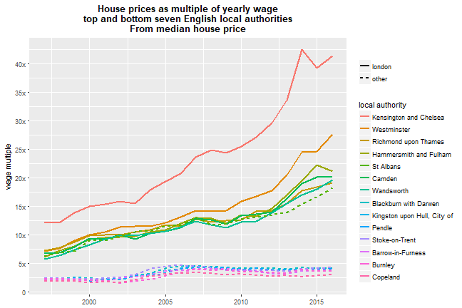
Here’s what it looks like with Kensington and Chelsea included. Note: this uses a pre-selected sub-set of the more well-known local authorities we used on the course. For reproducing it yourself, I’ve included code and data below that has all the local authories - London, of course, has more of the top values once all are used. Note note: this is using mean house prices per local authority - there’s also code below for using the median, which brings the values closer to those in e.g. this Guardian article. I think using mean house prices might give a better picture of how some very high value properties (of which London has plenty of course) affect affordability - views welcome.
Anyway - data! –>

Yikes. The average house in Kensington and Chelsea has gone from just under twenty times the median wage to not far off seventy times now. Good God. Part of the reason is shown if you just plot the wage multiple against the median wage itself:
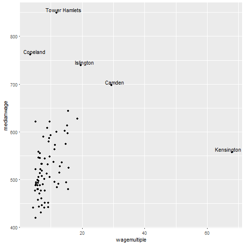
Kensingon and Chelsea is out there on the right by itself: actually not that high a median wage but by far the largest wage multiple for housing. So what this is likely showing: as well as having some of the priciest housing, it also has many lower-waged people. It’s a highly mixed area. In some imaginary future (I’m sure this would never happen…) where much of the area’s social housing tenants had moved elsewhere, the wage multiple would drop.
The NOMIS data actually contains every wage percentile - it’s very gappy for 90th percentile as they don’t include numbers that are not statistically reliable and there aren’t enough people in that category. At any rate - looking at other percentiles might provide a deeper look at what’s going on.
The lowest-value areas (easier to see in the minus-Kensington graph in the other post) have certainly seen the gap increase - something like five times to ten times the median wage over the data period. But there’s also a dynamic that I’ve seen in data at local scales too: after the 07/08 crash, the poorest areas have seen house values decline (even relative to wages, it appears) where the richer areas have continued on up. For some of the richest, the crash looks like little more than a dink in that.
There are some other slightly puzzling areas with very high median wages and low house values. I’m a little suspicious of the data for those (e.g. Copeland in the point plot above) but more digging also required…
Code and data to play with yourself
To end: here’s some R code with links to tidied data for both median wages and English house prices if you want to reproduce this or look at different areas. It’s about the same as the course code but (1) it uses all local authorities so London now has six of the top seven values; (2) I’ve added median house price in too (plotted at the end), which is more in line with the values in the Guardian article linked above. At some point I’ll come back to grabbing and tidying the data / getting the Land Registry data geocoded etc.
library(dplyr)
library(ggplot2)
library(forcats)
library(readr)
library(tidyr)
library(lubridate)

#Load median wages at local authority level 97 to 2016
#taken from NOMIS and tidied
#This is in the course folder or download from here then stick in data folder for project
#https://www.dropbox.com/s/66cd8jqoltv1l30/medianWages_localAuthority.csv?dl=1
wages <- read_csv('data/medianWages_localAuthority.csv')

#Gather year into a single column
wagesLong <- wages %>%
  gather(key = year, value = medianwage, `1997`:`2016`)

#If you want a quick look at the wage data...
# ggplot(wagesLong, aes(x = year, y = medianwage)) +
#   geom_boxplot()

#Load all tidied English housing data, not just sub-selection
#Download from here then stick in data folder for project
#https://www.dropbox.com/s/pzas4l1uc4piu5f/landRegistryPricePaidEngland_w_LADs_allchar.rds?dl=1
sales <- readRDS('data/landRegistryPricePaidEngland_w_LADs_allchar.rds')

sales$year <- year(sales$date)

#Summarise at house prices at local authority level and per year
saleSummary <- sales %>%
  group_by(localauthority,year) %>%
  summarise(meanPrice = mean(price),
            medianPrice = median(price))

#Make year numeric
wagesLong$year <- as.numeric(wagesLong$year)

#Join house price and wage data
price_n_wage <- inner_join(
  wagesLong,
  saleSummary,
  by = c('year', 'Area' = 'localauthority')
)

#Make new variables using mutate - yearly wage and house price as multiple of that
price_n_wage <- price_n_wage %>%
  mutate(
    medianwageyearly = medianwage *52, # weekly wage to yearly wage
    wagemultipleFromMean = meanPrice / medianwageyearly, # house price as multiple of that yearly wage
    wagemultipleFromMedian = medianPrice / medianwageyearly # house price as multiple of that yearly wage
    )

#Use 2016 wage multiple as an index for picking out the top and bottom England values
#Handy to look at directly
price_n_wage2016 <- price_n_wage %>%
  filter(year == 2016) %>%
  arrange(-wagemultipleFromMean)

#Zones to show in plot (one of at least three ways of doing this)
#Include Kensington and Chelsea, exclude last entry as no wage data
zoneselection <- price_n_wage2016 %>% slice(c(1:7,309:315))

#Not South Bucks - rest of top 7 are in London
londonzones <- zoneselection$Area[1:6]

#Add flag for London zones
price_n_wage <- price_n_wage %>%
  mutate(inLondon = ifelse(Area %in% londonzones, 'london','other'))

ggplot(price_n_wage %>% filter(Area %in% zoneselection$Area),
       aes(x = year, y = wagemultipleFromMean, colour = fct_reorder(Area,-wagemultipleFromMean))) +
  geom_line(aes(linetype = inLondon), size = 1) +
  ylab('wage multiple') +
  labs(colour = 'local authority', linetype = ' ') +
  scale_y_continuous(breaks = seq(from = 0, to = 80, by = 5),
  labels = c('0','5x','10x','15x','20x','25x','30x','35x','40x','45x','50x','55x','60x','65x','70x','75x','80x')) +
  ggtitle("House prices as multiple of yearly wage\ntop and bottom seven English local authorities\nFrom mean house price") +
  theme(plot.title = element_text(face="bold",hjust = 0.5),
        axis.title.x=element_blank())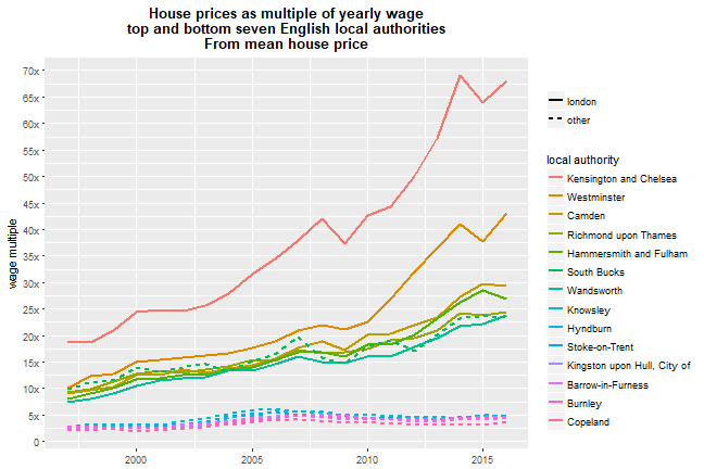
And the same plot but with median house price