I recently ran a day course on visualising data with R for the Urban Big Data Centre in Glasgow. I used the rather high-falutin’ phrase ‘principles of visualising data with ggplot’ - why principles? Because (a) once you get the basic principles of ggplot, you can run with the rest and (b) they’re not all that obvious when you’re starting out. So the aim of day was: get to the point where the ggplot cheatsheet makes some sense. (We also worked with the data wrangling cheatsheet; you can get to both of these via RStudio’s own help menu too.)
Same as with the last workshop I’ve written it up so it can be worked through by anyone.
-
There’s a pre-amble course chunk for anyone totally new to R. It goes through the basics of R, RStudio and dataframes - it’s in the form of an R project. That zip can be downloaded from here. The PDF is in the course booklet folder.
-
The main course folder can be downloaded here. It’s the same folder structure but doesn’t have an already-made RStudio project, so you’ll just have to make a new one - that’s explained in the course booklet (again, in the folder of the same name).
The day used two datasets, pre-wrangled into more friendly form. First, Land Registry house price data for England - the original data can be downloaded in one ~4gb chunk from here. Second, median wage data at local authority level from NOMIS. There was also a bit of Census employment data in there.
One of the main things to get across about principles: data wrangling and visualisation are two sides of the same coin. The tidyverse has done a sublime job of making those two things work smoothly together in R. As Hadley sez: ‘by constraining your options, it simplifies how you can think about common data manipulation tasks’. I went for a tidyverse first approach and I think it paid off. As long as you’re very careful to be clear what’s actually happening with things like the pipe operator (clue’s in the name so it’s intuitive enough once explained), it’s all good. It’s also much, much less boring than wading through the entirety of base-R first. Bits can be introduced where needed but you don’t need everything.
At some point I’ll post up the pre-wrangling code: it’s useful for showing how to get Land Registry housing data geocoded using the - also freely available - codepoint open postcode location data, binning house location points into geographical zones etc.
I wasn’t sure how much of the original housing data would fit onto the machines we were using, so only included a subset of data to use (that’s in the zip above). The whole thing for England can be downloaded here as an RDS file. Load into R (assuming you’ve downloaded and put into a data folder in your R project) with the following. It decompresses to about 1.7gb in memory.
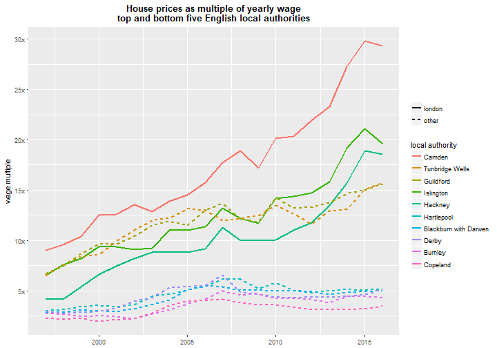
sales <- readRDS('data/landRegistryPricePaidEngland_w_LADs_allchar.rds')The most startling part for me was linking house price data to the NOMIS median wage data - I talk about that a lot more in its own post here. tl;dr: London! Oh my God!
The optional extras at the end include something on prettifying graphs, how to cram as much into one graph as humanly possible. This quote’s been doing the rounds: ‘a designer knows they have achieved perfection not when there is nothing left to add, but when there is nothing left to take away’… RUBBISH! THROW IT ALL IN THERE! EVERY FIGURE IS 250 WORD EQUIVALENT IN PAPERS! Well, no, it’s not rubbish, obviously, but there are times…
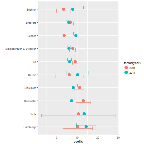
There’s also a bit on outputting multiple plots to a folder and lastly, inspired by the amazing R for Data Science book, a section on visualising coefficients and error rates from many regression outputs. Statistically dodgy (spatial/temporal data with no account of autocorrelation) but gets the point across. Because regression tables schmregschmession schmables, I say. See below: it’s just Census employment data versus house prices in some TTWAs. Oh and then a little easy mapping thing to end to illustrate another idea for using dplyr.
Any questions, feel free to ask: d dot olner at sheffield dot ac uk or on that there Twitter.
House prices as a multiple of wages
Pulling out model values into a viz
X axis: percent increase in house prices for a 1 percent increase in employment in wards for those TTWAs. (Note point above: illustration of pulling out model values, not a good model!)