
TL;DR
- This looks at one persnickety issue that appears trivial but is a bit more nuanced than it appears: (1) finding change over time (2) when using geographical zone data (3) when you want to know how some sub-population in those zones has changed.
- Out of four ways of measuring that change, the one I find most useful and intuitive is: percentage change of the sub-population as a proportion of the zone total population in the first time period.
- E.g. if the subpop and total pop are 50/200 and 60/350 for two consecutive time points, find ((60-50)/200) * 100 to get a percentage (+5% change in this case).
- This preserves zone proportionality while also keeping the correct change polarity if total zone population has a large change too. I also find it more intuitive: it’s asking e.g. “how has the student population changed compared to the total population of the zone last year?”
Why?
Measuring how things change over time is straightforward for single items or aggregate values: either use the raw change or find proportion change. For the latter, you can also just use natural log values - if the proportions aren’t too large, the difference between the natural log of time points is an good approximation of percent change. (That link has a nice little table showing at what values the match diverges.)
It becomes more complicated, though, once you start using geographical zones - and particularly if you’re wanting change for some sub-population in those zones.
It’s actually really simple but if you’re using geographical data to look at change over time, this choice can have a large impact on the outcome, potentially reversing the polarity of values. That may be important if you’re using it for modelling e.g. how change of a sub-population impacts some other variable.
Toy example
First-up, the libraries we’ll be using:
library(tidyverse)
library(sf)
library(tmap)
Here’s some toy population data for a bunch of zones. We want to know how much the student population has changed between two years. First, though, let’s get some geographical zones - doesn’t matter where, they’re just for illustration. (These happen to be four LSOAs in Sheffield.)
zones <- readRDS(gzcon(url('https://www.dropbox.com/s/h4qgf3bt7ooiqjd/fourzones.rds?dl=1')))

plot(st_geometry(zones))
Let’s give those some pretend data for population numbers, for t minus 1 (last year) and t (this year). We’ll make a copy of the neighbourhood for both years then row-bind them into a single sf dataframe:
#Nicer zone names
zones$code = c(1:4)

neighbourhood_t <- zones
neighbourhood_tminus1 <- zones

#Last year
neighbourhood_tminus1$totalpop <- c(200,350,50,100)
neighbourhood_tminus1$studentpop <- c(50,30,10,1)
neighbourhood_tminus1$year = 't minus 1'

#This year
neighbourhood_t$totalpop <- c(350,400,80,150)
neighbourhood_t$studentpop <- c(60,30,30,4)
neighbourhood_t$year = 't'

#Join those both together
neighbourhood <- rbind(neighbourhood_tminus1,neighbourhood_t)

#Make sure R knows what order time is in
neighbourhood$year <- factor(neighbourhood$year, levels = c('t minus 1','t'))
We can see how total population changed between the two time points using tmap:
tm_shape(neighbourhood) +
  tm_polygons('totalpop') +
  tm_facets('year')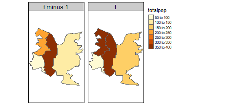
The issue with that: our zones are different sizes. Other things being equal, we’d expect larger zones to have a bigger population. The most obvious way to deal with that: if we’re looking at total population, we can use population per unit area. Or if we’re looking at a sub-group - students, say - we can just find what proportion of the population they are:
neighbourhood <- neighbourhood %>%
  mutate(percent_students = (studentpop/totalpop)*100)

tm_shape(neighbourhood) +
  tm_polygons('percent_students') +
  tm_facets('year')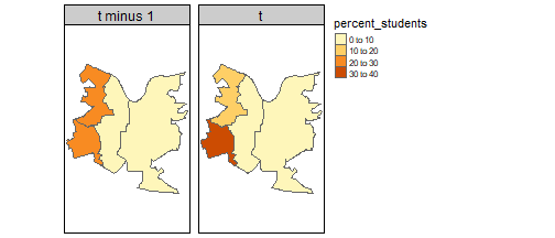
Change over time
So how did the number of students change between those two years? We can start with the most obvious measure, just finding change in the raw number of students between time points. Dplyr’s lag function does the job.
Here, arrange is just making sure years are ordered correctly. They are already in the correct order here but worth remembering this is a necessary step for lag to work: it needs to know the order to find correct lag values in sequence. We could also use ‘order_by = year’ to do it, but I think this is tidier (especially if you’re doing calculations with several instances of lag, as we do below). Group by geographical zone (code) as we want lag per zone.
change <- neighbourhood %>%
  arrange(year) %>%
  group_by(code) %>%
  mutate(totalchange = studentpop - lag(studentpop))
It might be more clear to see these just as bars so we can see the exact numbers. Note, for plotting we also drop the empty first year that we don’t have lag values for.
change %>% filter(year == 't') %>%
  ggplot(aes(x = code, y = totalchange)) +
  geom_col()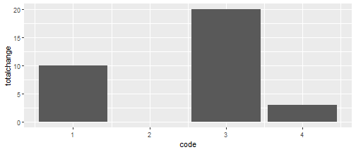
We can see one zone saw no increase in student numbers, and another had a massive increase. But - again - without accounting for the zone’s size, we don’t know if this increase is actually large, relative to the zone’s population.
And the solution might be the same as before: find the proportion of change in the numbers of students between the two time points. We’ll add to the same dataframe with the original totalchange variable, adding proportion change, so we can compare. (Unwieldy long names will make sense in a moment…)
change <- change %>%
  mutate(
    percentchange_intotalstudents = (studentpop-lag(studentpop))/lag(studentpop)*100
    )

#plot again
change %>% filter(year == 't') %>%
  ggplot(aes(x = code, y = percentchange_intotalstudents)) +
  geom_col()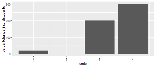
Now zone 4 shows an alarmingly mahoosive rise in student numbers: up by 300%! But we can see from the previous plot, student numbers only went up by 3. Looking at the actual data, we can see in zone code 4 there was only 1 student last year. So an additional 3 is indeed a 300% increase. But given the total zone population is now 150, students only make up 2.7% of the population.
| year | code | totalpop | studentpop | percent_students |
|---|---|---|---|---|
| t minus 1 | 1 | 200 | 50 | 25.000000 |
| t minus 1 | 2 | 350 | 30 | 8.571429 |
| t minus 1 | 3 | 50 | 10 | 20.000000 |
| t minus 1 | 4 | 100 | 1 | 1.000000 |
| t | 1 | 350 | 60 | 17.142857 |
| t | 2 | 400 | 30 | 7.500000 |
| t | 3 | 80 | 30 | 37.500000 |
| t | 4 | 150 | 4 | 2.666667 |
So maybe we want the change in proportion of students between years? We’ve already found students as a percentage of the total population, so we can just lag that (adding to our previous measures):
change <- change %>%
  mutate(percentchange_in_propofstudents = percent_students-lag(percent_students))

change %>% filter(year == 't') %>%
  ggplot(aes(x = code, y = percentchange_in_propofstudents)) +
  geom_col()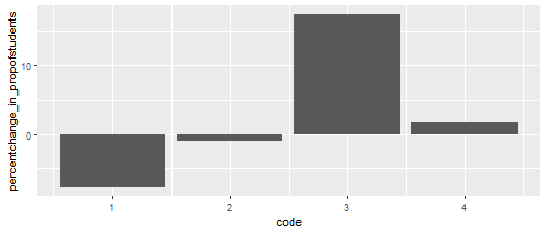
Huh. Now we have a couple of negative values. We already know raw student numbers have increased - but this shows, as a proportion of zones one and two, they’ve actually decreased.
And it may be that’s the change metric you’re after, but I find it dissatisfying. It may matter greatly (for e.g. modelling a reaction to changing sub-populations) whether numbers are increasing or not, so it might be essential to preserve that information. But I don’t want a metric that treats an increase from 1 to 4 as a much more intense change, if proportionally it’s trivial.
A simple solution is this: just use the first time period total population for the proportion denominator for both student counts. So for our zone 1 example, this would be 50/200 for t minus 1 and 60/200 for t. This preserves the polarity of change but keeps it proportional to the geographical zone. As it’s the same denominator for both, that can just be (60-50)/200:
change <- change %>%
  mutate(propdiff_over_tminus1 = ((studentpop-lag(studentpop))/lag(totalpop))*100)

change %>% filter(year == 't') %>%
  ggplot(aes(x = code, y = propdiff_over_tminus1)) +
  geom_col()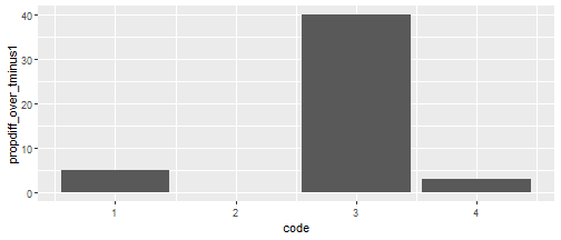
That makes more intuitive sense to me: we’re asking, how has the student population changed compared to the total population of the zone last year? Comparing to a fixed population value makes it more comparable, I reckon, and using the first time period makes more sense logically, if we’re thinking about causation (which we usually are).
Putting all of them together to compare:
change %>%
  filter(year == 't') %>%
  select(code,totalchange:propdiff_over_tminus1) %>%
  gather(key = metric, value = value, totalchange:propdiff_over_tminus1) %>%
  mutate(metric = factor(metric, levels = c(
    'totalchange',
    'percentchange_intotalstudents',
    'percentchange_in_propofstudents',
    'propdiff_over_tminus1'
  ))) %>%
  ggplot(aes(x = code, y = value)) +
  facet_wrap(~metric, scales = 'free_y') +
  geom_col()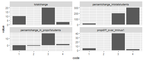
To summarise: for measuring change over time of sub-groups (students in this case) in geographical zones -
- Total change doesn’t account for zone population so doesn’t mean much.
- Percent change in total students gives proportional change for students but also doesn’t account for zone population. So large changes in small numbers seem unreasonably prominent.
- Percent change in proportions may be what you need, but it introduces a new problem: we can lose the polarity of change. That depends on how much total population changes, and we may not want that.
- Percent change relative just to t minus 1 solves that polarity issue and - to my eye at least - makes more intuitive sense. It has its own downside: the proportion can appear quite high compared to the current population. So you have to remember, and communicate, exactly what it is measuring.