ONS Business Demography dataset 2017-22: what does it say about South Yorkshire?
Headlines
- High growth firms in South Yorkshire and nationally (10+ employees and 20%+ employee growth av per year over 3 years):
- Since 2017, the number and proportion of high growth firms has dropped almost everywhere - but the position of different regions relative to each other have hardly changed.
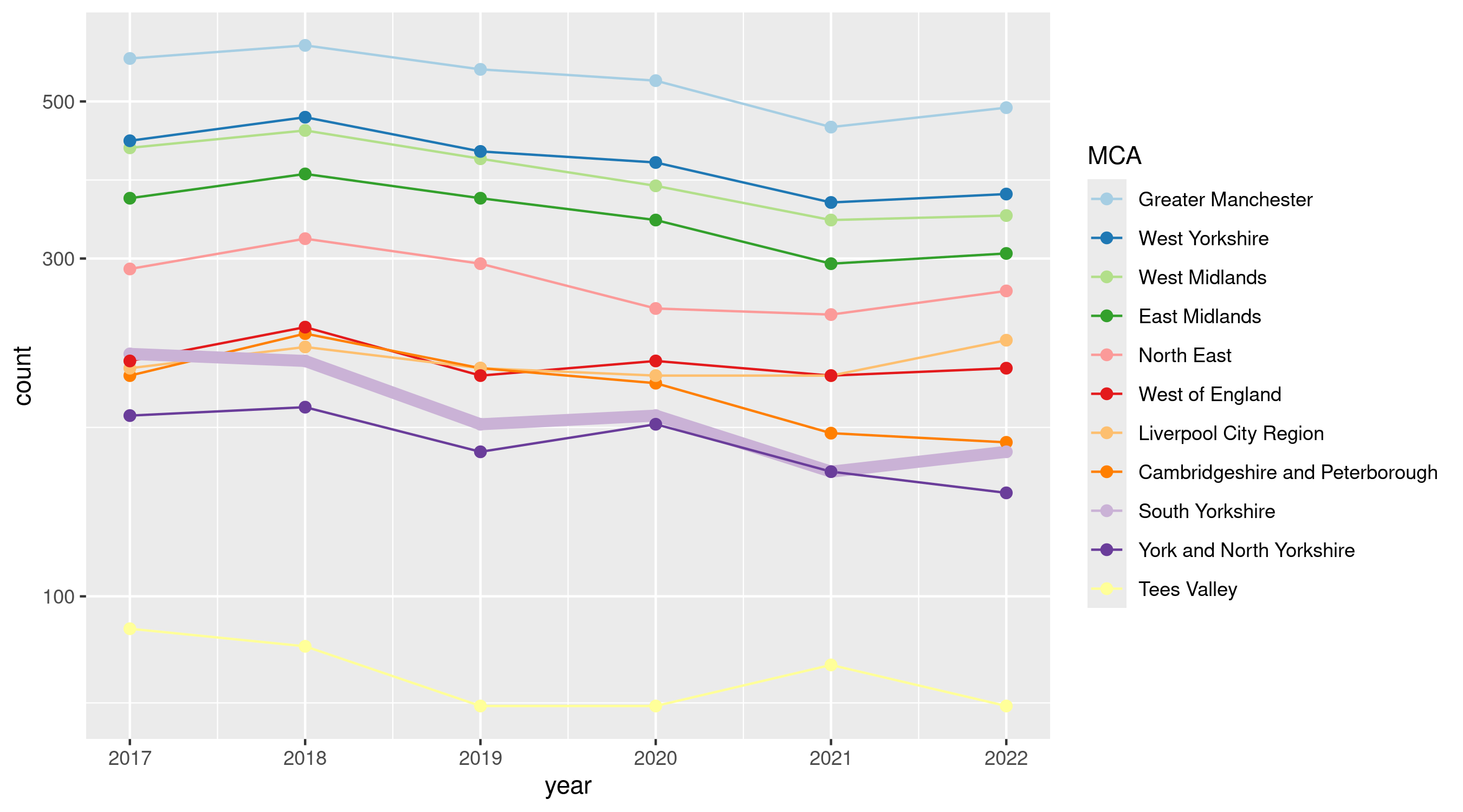
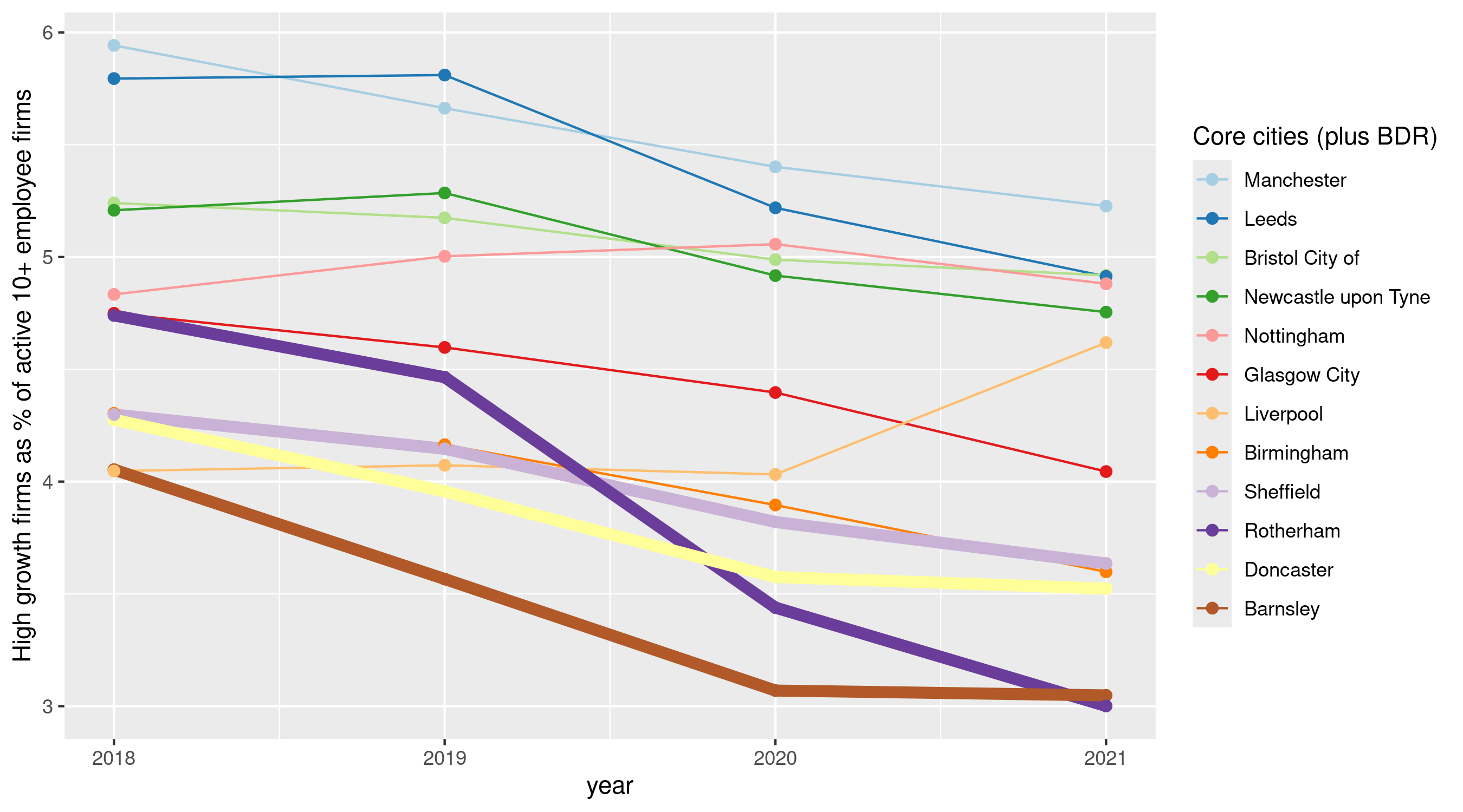
- South Yorkshire (and Sheffield, Barnsley, Doncaster + Rotherham separately) have remained at or near the bottom for proportion of high growth firms, with Rotherham in particular dropping over time. (See Figure 1 for raw MCA numbers, Figure 2 as percent of active & Figure 3 for the 4 places - hover for preview or see below.)
- Business births and deaths:
- Nationally, business births have outnumbered deaths in every year in this data (though with exceptions, see map below) - but firm deaths have steadily increased in last 4 or so years.
- South Yorkshire is near the top of MCAs for births as a percent of active firms - increasing over time, putting it in a higher group with West Midlands, Liverpool and Greater Manchester. SY has followed the national trend of increasing firm deaths as a percent of active firms, sitting in the middle rankings. (See Figure 4.)
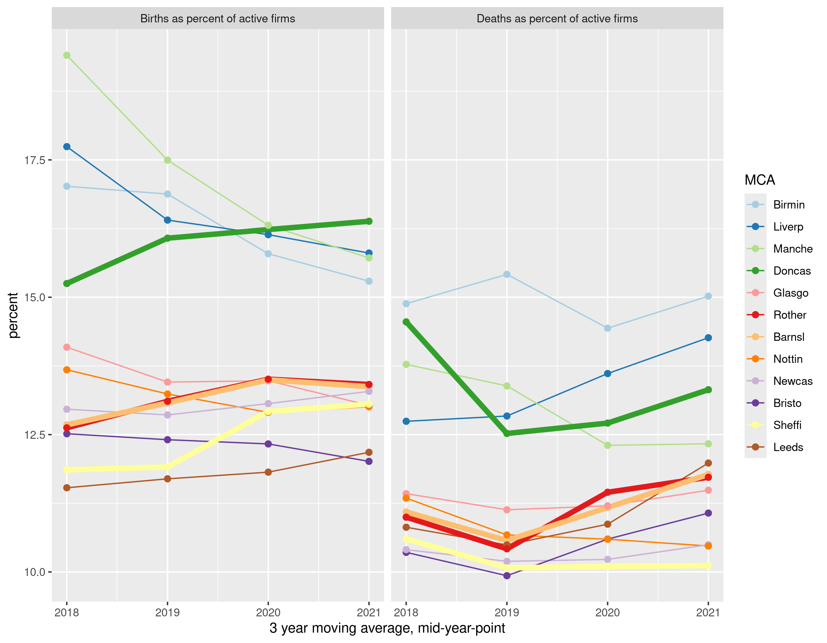
- Figure 5 examines the same for ‘core cities’ in England/Scotland plus Barnsley, Doncaster & Rotherham (BDR). The stand-out here is Doncaster with high birth and death proportions compared both to other core cities and BDR. Since 2018-20, all four places except Sheffield have seen births and deaths relative to active firms rise. Sheffield is relatively low for births and, in this data, it has dropped to the lowest birth value for the 2020-22 average. (Note: only compared to the local authorities in this short list.)
Maps
- Four maps below give an overview of the national picture:
- Figure 6 shows the linear trend over time for firm births and deaths nationally, expressed as % change per year (approx) with births in the top map and deaths below it (South Yorkshire overlaid in thicker black). Regional clustering is evident but - apart from Doncaster’s dropping death rate (which has been climbing again in more recent years) - South Yorkshire doesn’t stand out.
- Figure 7 is a map of the linear trend for high growth firms - again, showing approx. percent change per year. This map confirms the story that high growth firm numbers have been consistently dropping (red) but shows that a patchwork of places in blue have seen high growth firm increases, with no obvious pattern. South Yorkshire fits the pattern of high growth firm decline.
- Figure 8 shows firm ‘turnover’ (2020-22 average). Turnover is a measure of churn: births plus deaths, divided by active firms. Bands of higher turnover/churn are present in the North, Midlands, across London and in South Wales, with Doncaster standing out in the North and the rest of South Yorkshire not especially low churn.
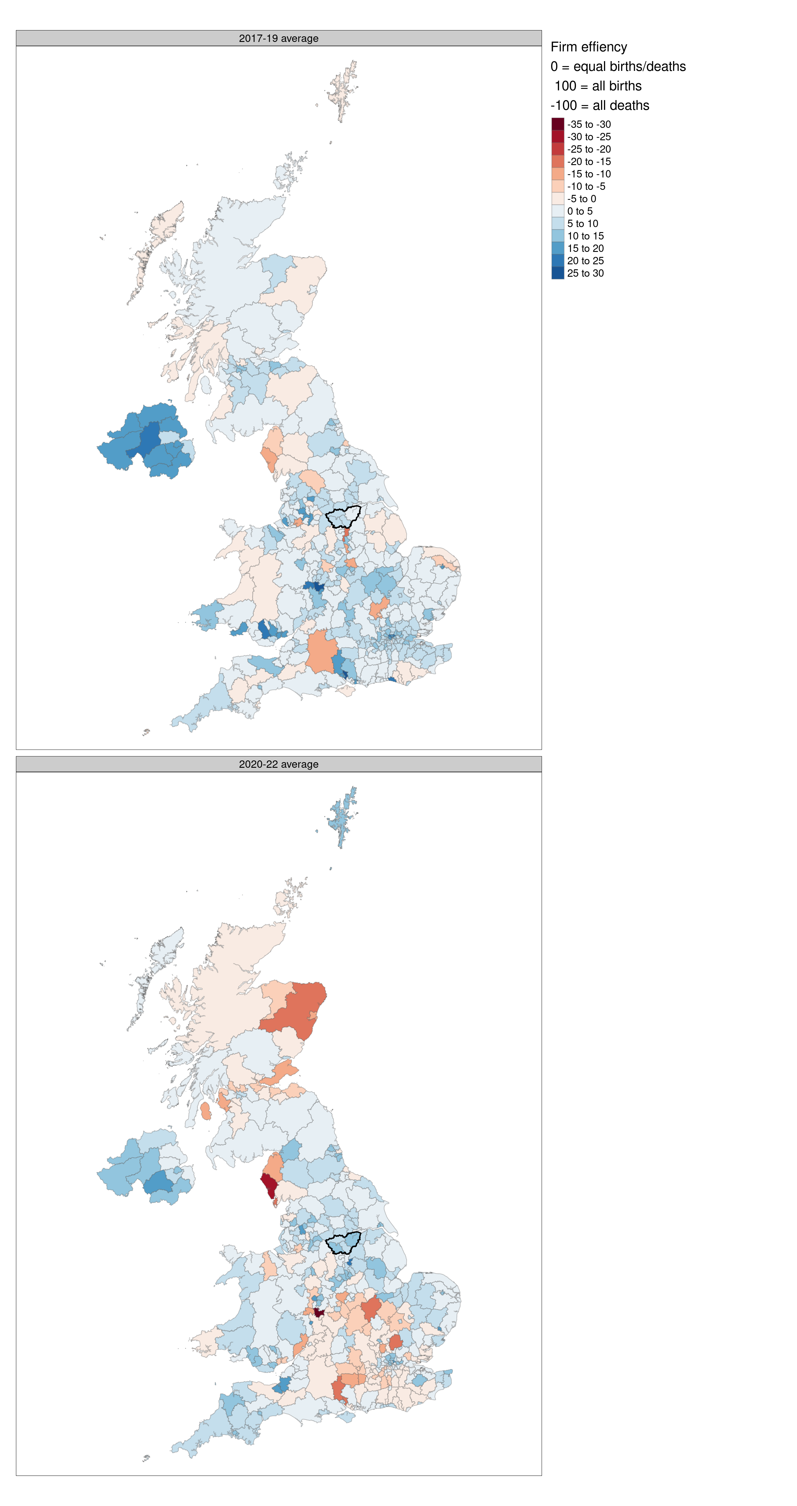
- Figure 9 shows ‘firm efficiency’ - a standardised measure of the balance of births & deaths, where values of +100 would be ‘all births no deaths’, -100 would be ‘all deaths no births’, and zero would be ‘births and deaths balance / cancel out’. This map compares two time points, showing how in the latter time period (bottom map, 2020-22) there has been a marked shift to more deaths than births in the South.
The data used
- The ONS Business Demography dataset contains counts of active firms, births, deaths, ‘high growth’ firms (20%+ employee growth over 3 years) and active firms with 10+ employees, from 2017 to 2022.
- Here, it has been harmonised to backcast 2022 local authority borders to create a time series not present in the original data.
- At local authority or MCA level, it does not break these counts down by sector (those are only at national level).
- R Code is here, quarto code for this report is here.
The detail / plots / maps
High growth firms
Raw high growth firm numbers have been declining almost everywhere in the UK since 2017. Figure 1 shows raw count of high growth firms for MCAs (thicker line is South Yorkshire).
However, most places haven’t changed relative position very much over time, with one or two exceptions.

The same overall pattern is visible in Figure 2, looking at high growth firms as a percent of active 10+ employee firms (“high growth firms” in ONS is also 10+ employees only).
Thicker line is South Yorkshire.
Liverpool City Region appears to be the only MCA bucking the trend.
Separate analysis shows it is mostly the drop in high growth firm count - not a large increase in active firms overall - causing this change. But note that firms can drop in/out of the “high growth” category with e.g. just one year of below-20% employee growth.
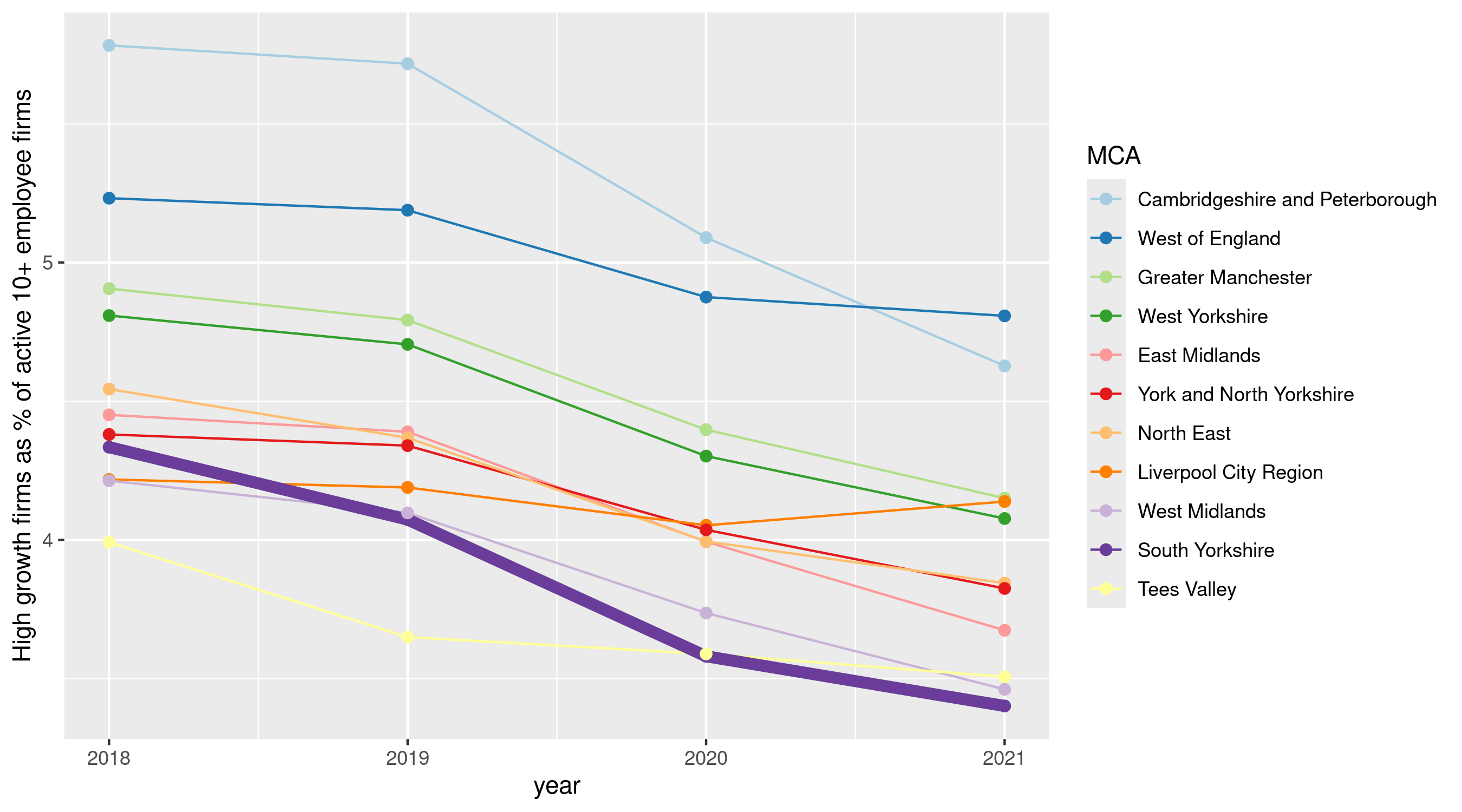
Figure 3 also shows high growth firms as a percent of active firms but showing Sheffield, Barnsley, Doncaster & Rotherham separately (thicker lines) against English/Scottish core cities (minus Cardiff & Belfast).
The same story of stable positions against secular trend dropping is here, with S+BDR always near the bottom - but Rotherham more recently dropping more than others (and again, Liverpool the only place here goin the other way).
Using 16+ in employment (not shown here) doesn’t change the relative position / direction of S+BDR.
Separate analysis again shows, for S+BDR, drops in raw ‘high growth’ firms against (smaller) rises in 10+ employee active firms.
Births and deaths
Nationally, business births have outnumbered deaths in every year in this data - but firm deaths have steadily increased in the last 4 or so years.
Figure 4 shows South Yorkshire near the top of MCAs for births as a percent of active firms - increasing over time, putting it in a higher group with West Midlands, Liverpool and Greater Manchester. SY has followed the national trend of increasing firm deaths as a percent of active firms, sitting in the middle rankings.
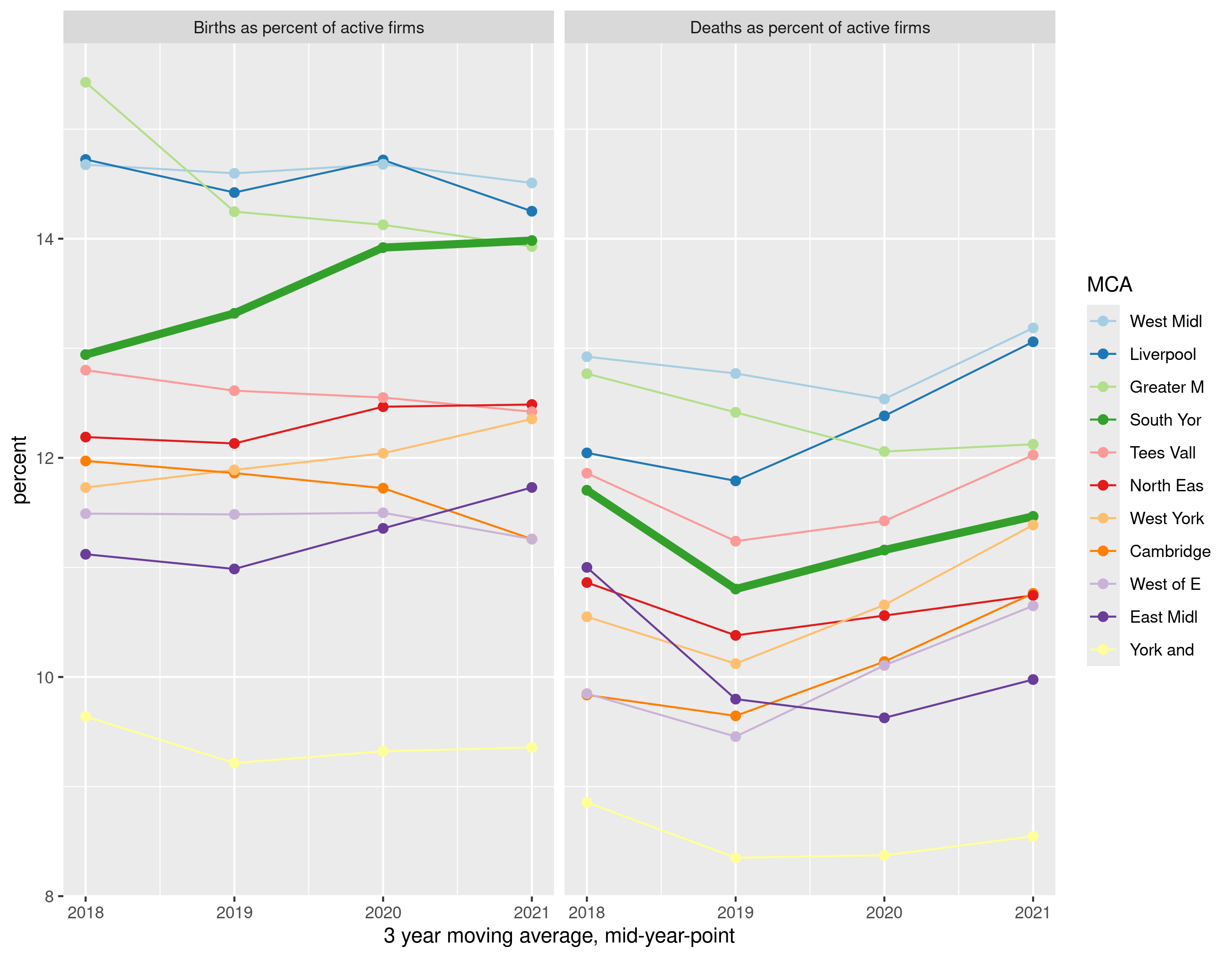
Figure 5 examines the same for core cities plus BDR. The stand-out here is Doncaster with high birth and death proportions compared both to other core cities and the other three SY places. Since 2018-20, all four places except Sheffield have seen births and deaths relative to active firms rise. Sheffield is relatively low for births and, in this data, it has dropped to the lowest firm death value. (Note: only compared to the local authorities in this short list.)
Maps
Figure 6 shows the linear trends for business births (top map) and deaths (bottom) for the whole of the UK, expressed as approximate percentage change per year on average. South Yorkshire is marked with a thicker black line.
The overall pattern of births is mixed and clustered across the UK - a swathe of the South dropping more than many other places. Increases and drops in deaths also cluster.
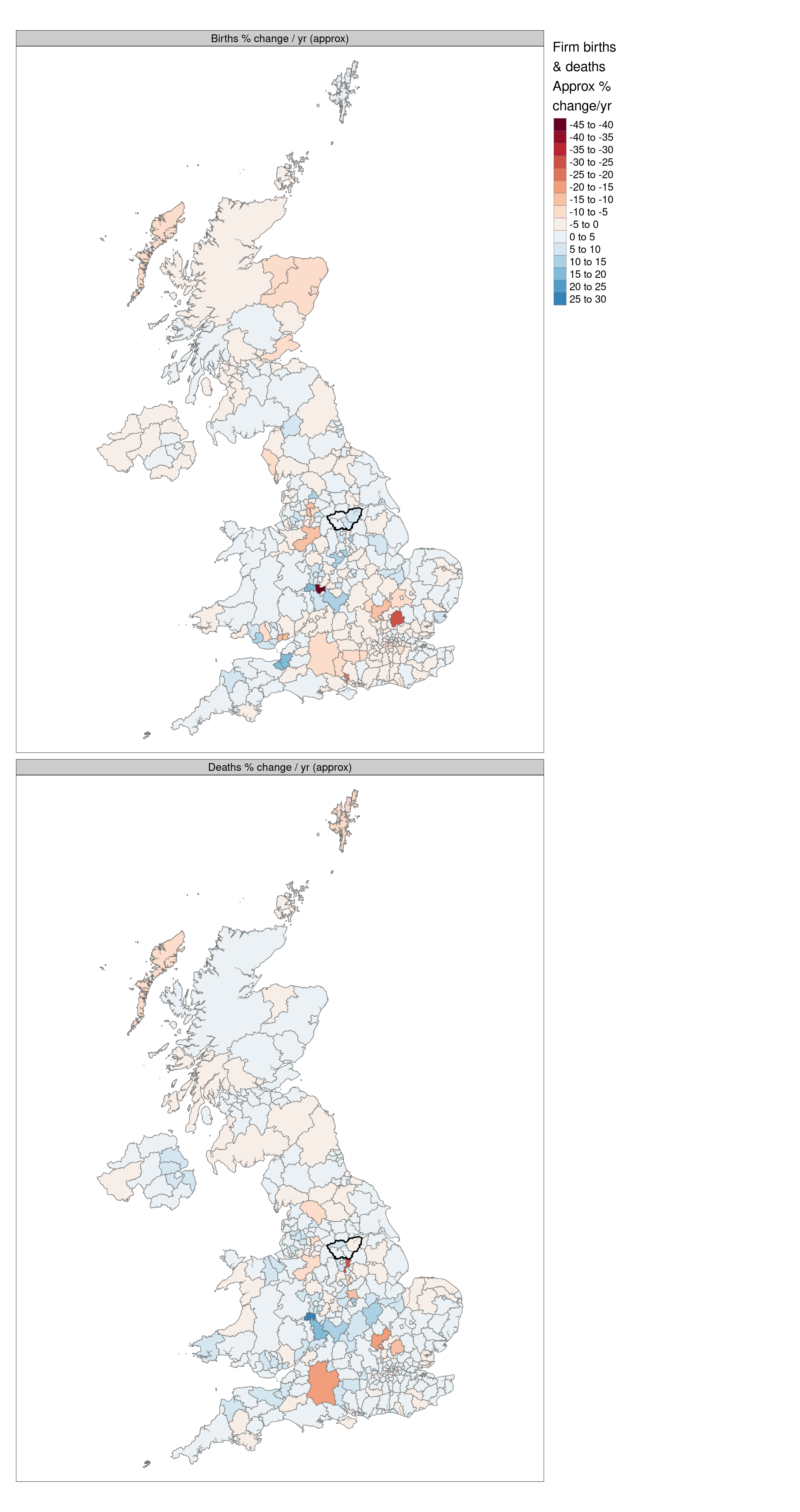
Figure 7 is a map of the linear trend for high growth firms - again, showing approx. percent change per year. This map confirms the story that high growth firm numbers have been consistently dropping (red) but shows that a patchwork of places in blue have seen high growth firm increases, with no obvious pattern. South Yorkshire fits the prevalent pattern.
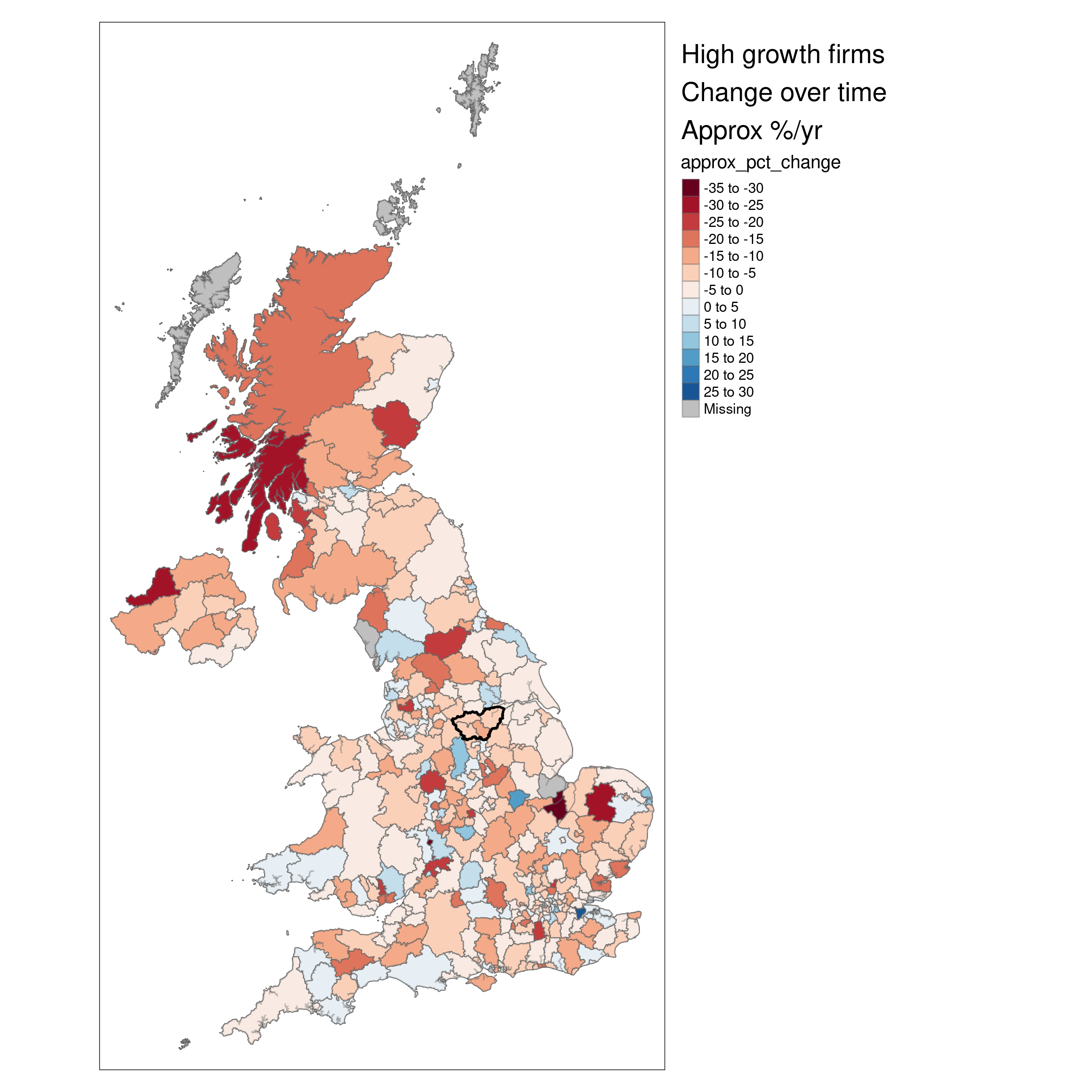
Figure 8 shows firm ‘turnover’ (2020-22 average) - a measure of churn that adds births and deaths together, and expresses those as a proportion of total active firms. Bands of higher turnover/churn are present in the North, Midlands, across London and in South Wales, with Doncaster standing out in the North and the rest of South Yorkshire not especially low churn.
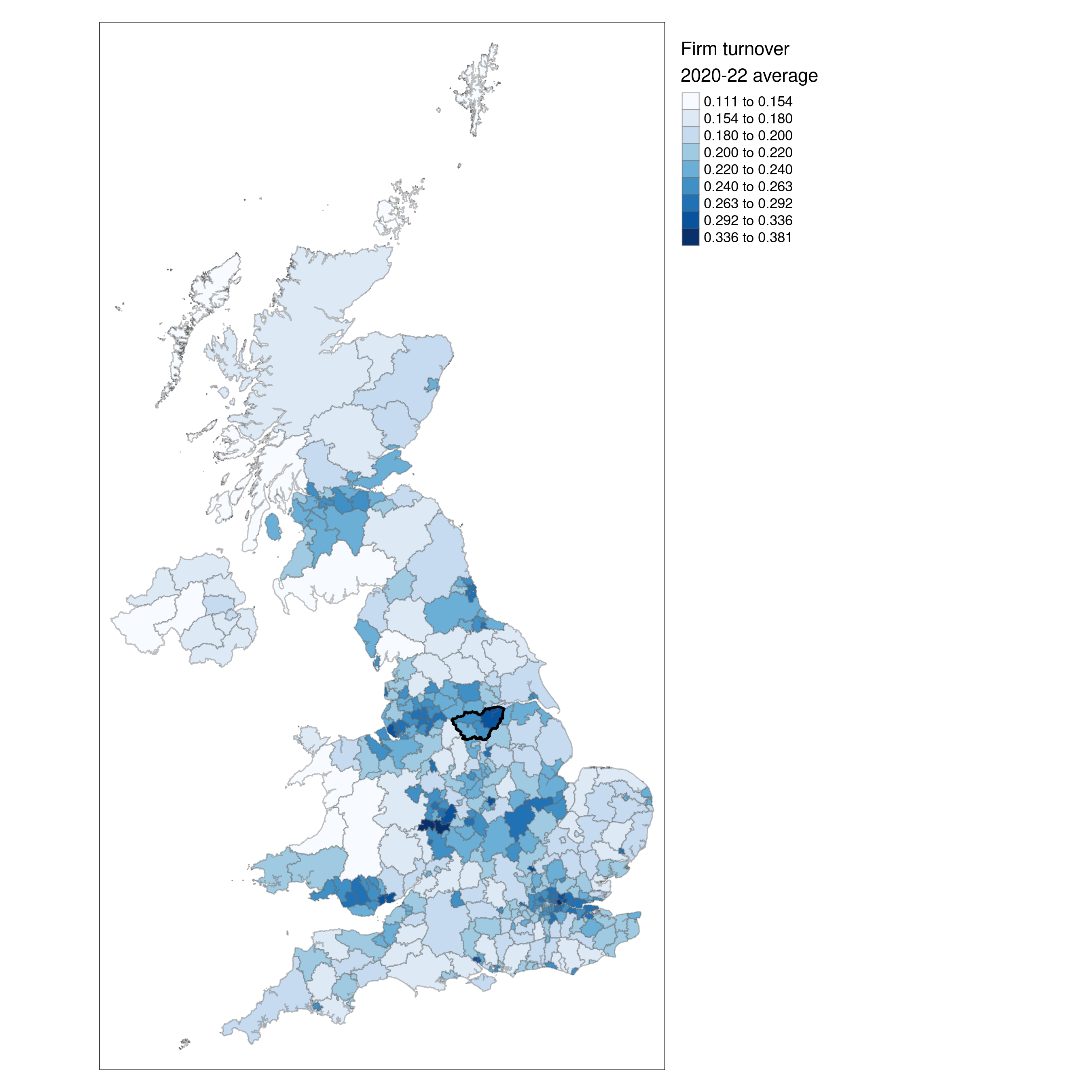
Figure 9 shows ‘firm efficiency’ - the balance of births & deaths - comparing two time points. Values of +100 would be ‘all births no deaths’, -100 would be ‘all deaths no births’, and zero would be ‘births and deaths balance’. This map shows how in the latter time period (2020-22) there has been a marked shift to more deaths than births in the South compared to earlier.
