“What can you see from your
“What can you see from your
house?”
house?”
Bulk analysis of line of sight
Bulk analysis of line of sight
accounting for landscape and
accounting for landscape and
building heights
building heights
Stephan Heblich, Dan Olner, Gwilym Pryce,
Christopher Timmins

What’s “bulk analysis of line of sight?”
• Model for finding line of sight between
many properties and points in the
landscape.
• Where other buildings may block that line
of sight...

Two examples
• One: Scottish wind farms. Which
properties can see wind turbines?
– (and what difference does that make?)
• Two: how much green space can
properties see?

The line of sight model
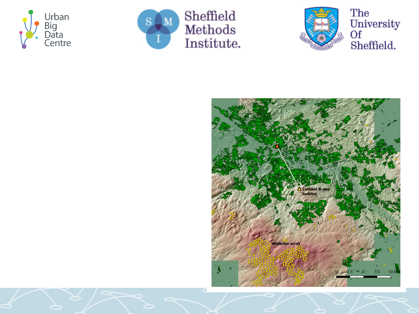
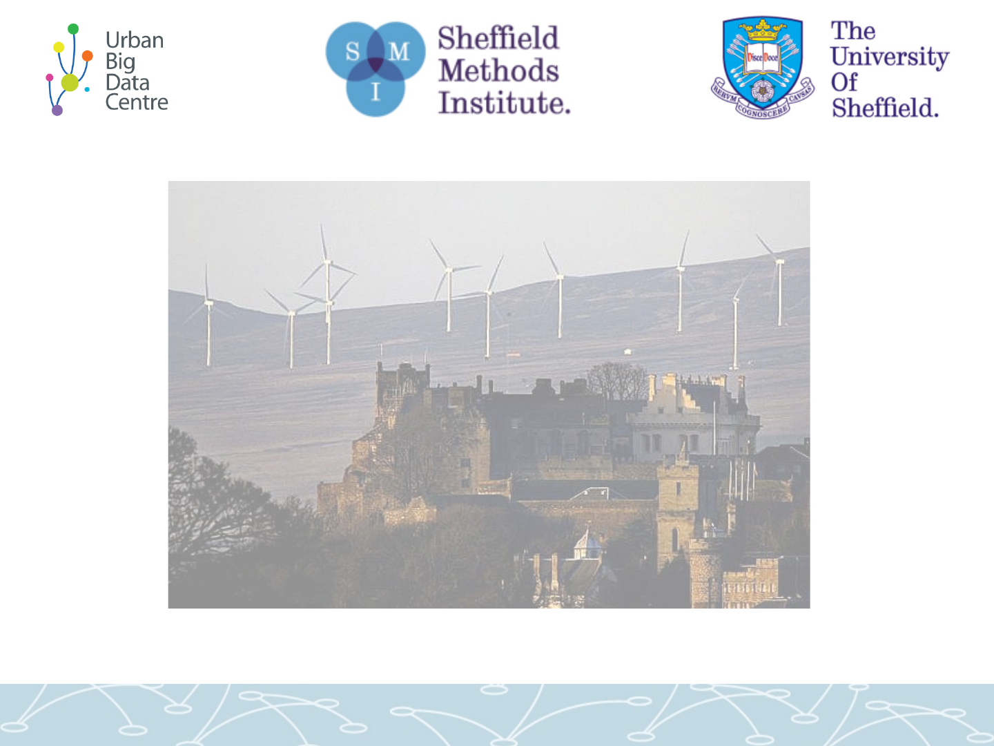
Landscape model for line-of-sight
• Example property
in Glasgow…
• Buildings laid on a
5m grid landscape
• Cathkin Braes ...
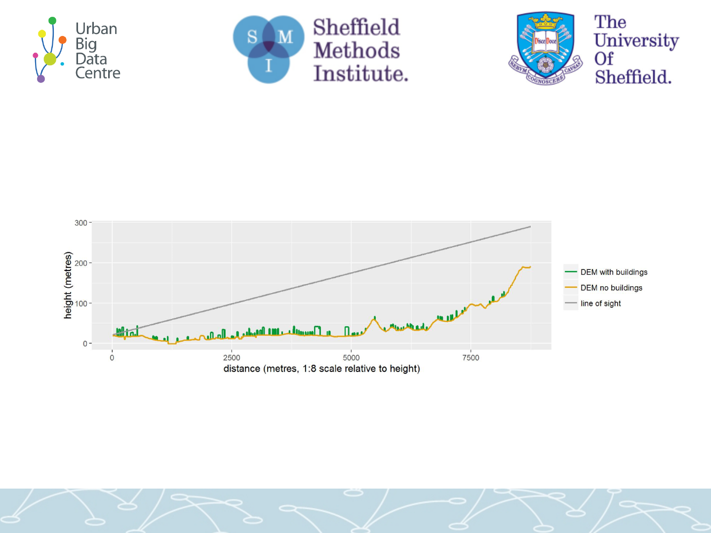
That line of sight in cross-section
(buildings vs terrain)

... then use this approach for
many properties.
For example:
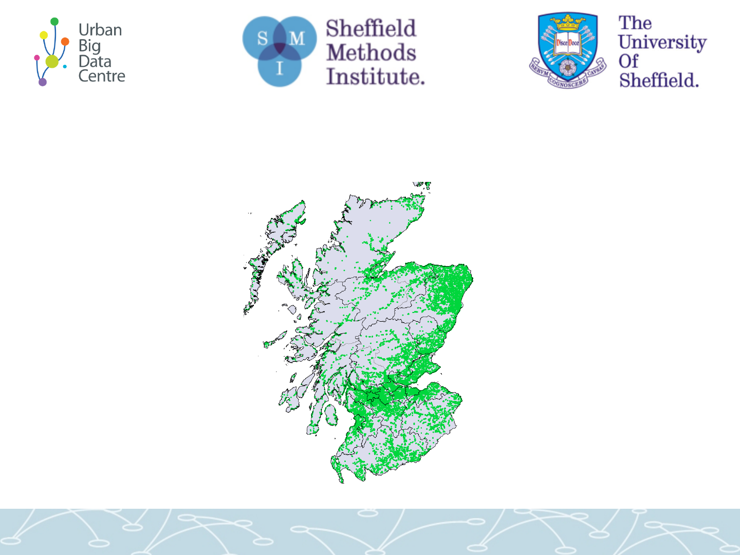
For whole of Scottish data we have buildings for:
Just terrain = 80% can “see” at least one turbine within 15km.
Building heights = 32%.
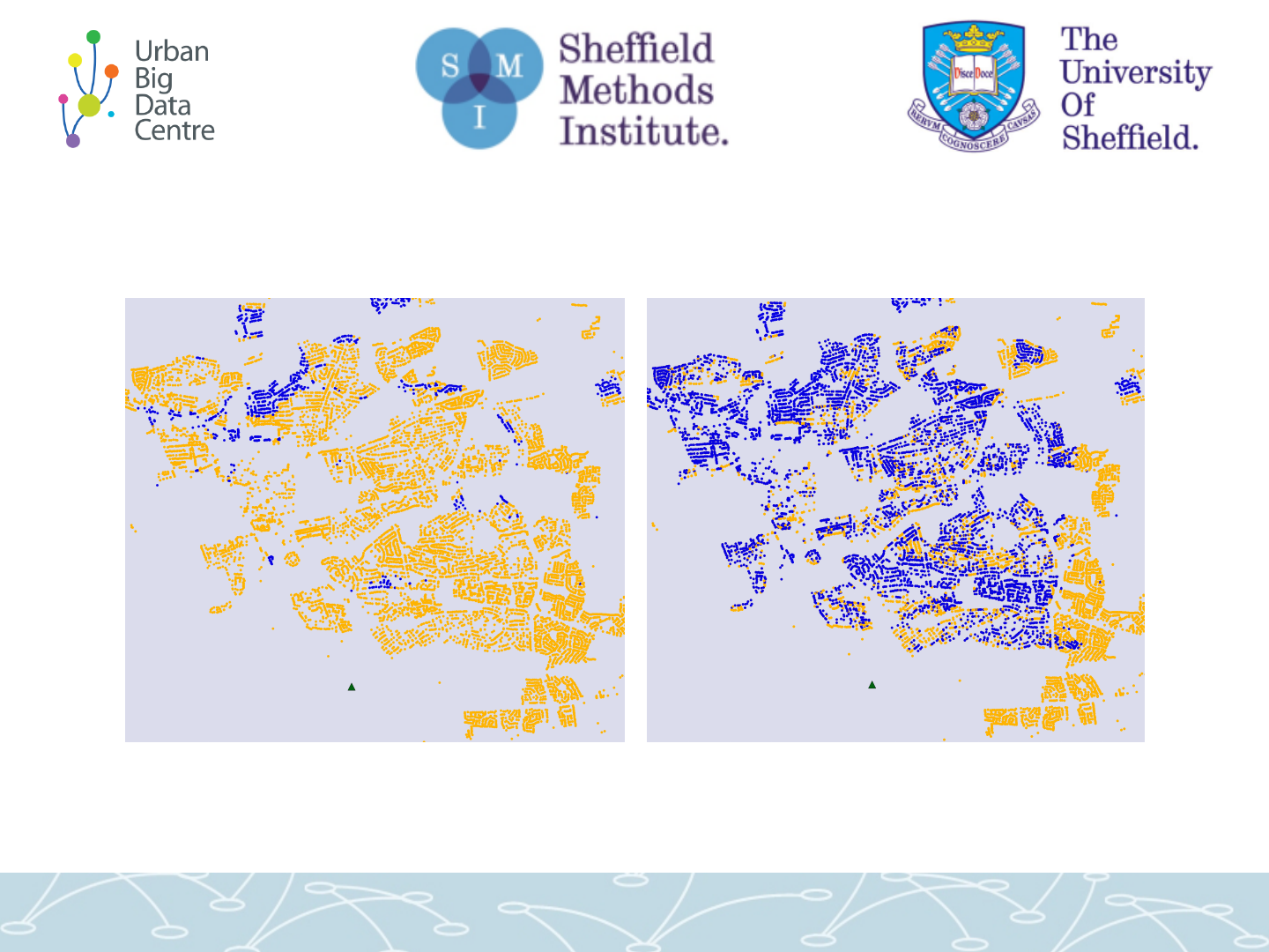
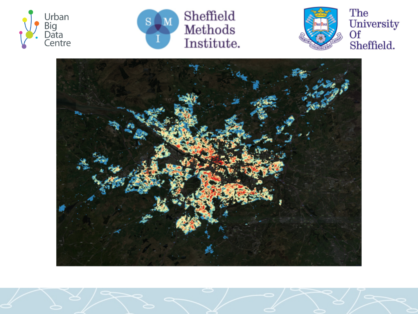
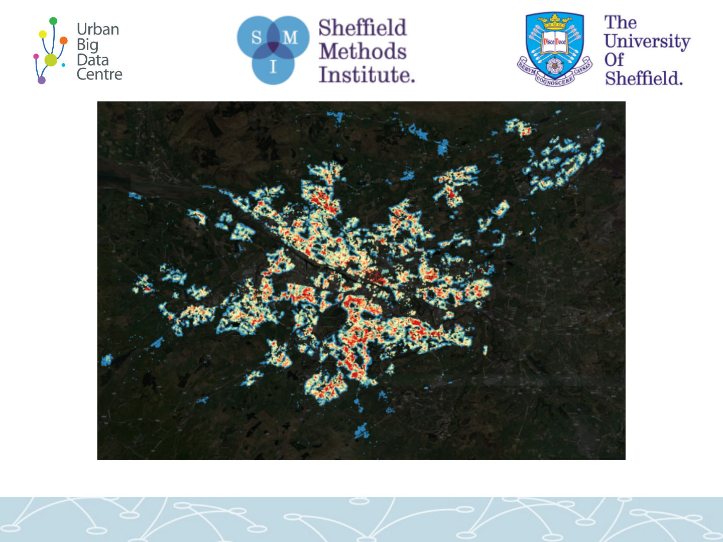
Just terrain vs building heights (Dunfermline)
Yellow = can see turbine / blue = cannot see
Terrain
Terrain plus buildings

1. Scottish Wind Farms

1. Scottish Wind Farms
Price impact…
and a quick look at whether
there’s unequal exposure

• We were asked: have wind farms impacted on house
prices in Scotland?
– Cf. Steve Gibbons: finds there is a negative impact in England
• Does it matter whether properties can see turbines? (Or is
it just proximity?)
• Is there a difference if line of sight is blocked by other
buildings (not just terrain)?
• Spoiler alert: price impact results were inconclusive /
insignificant. Scotland seems to be different to England.
• Will come back to that, but first…

The data and model...
• Bought together data on:
– Wind turbines
– Property prices (1990-2014)
– Landscape
– Built environment
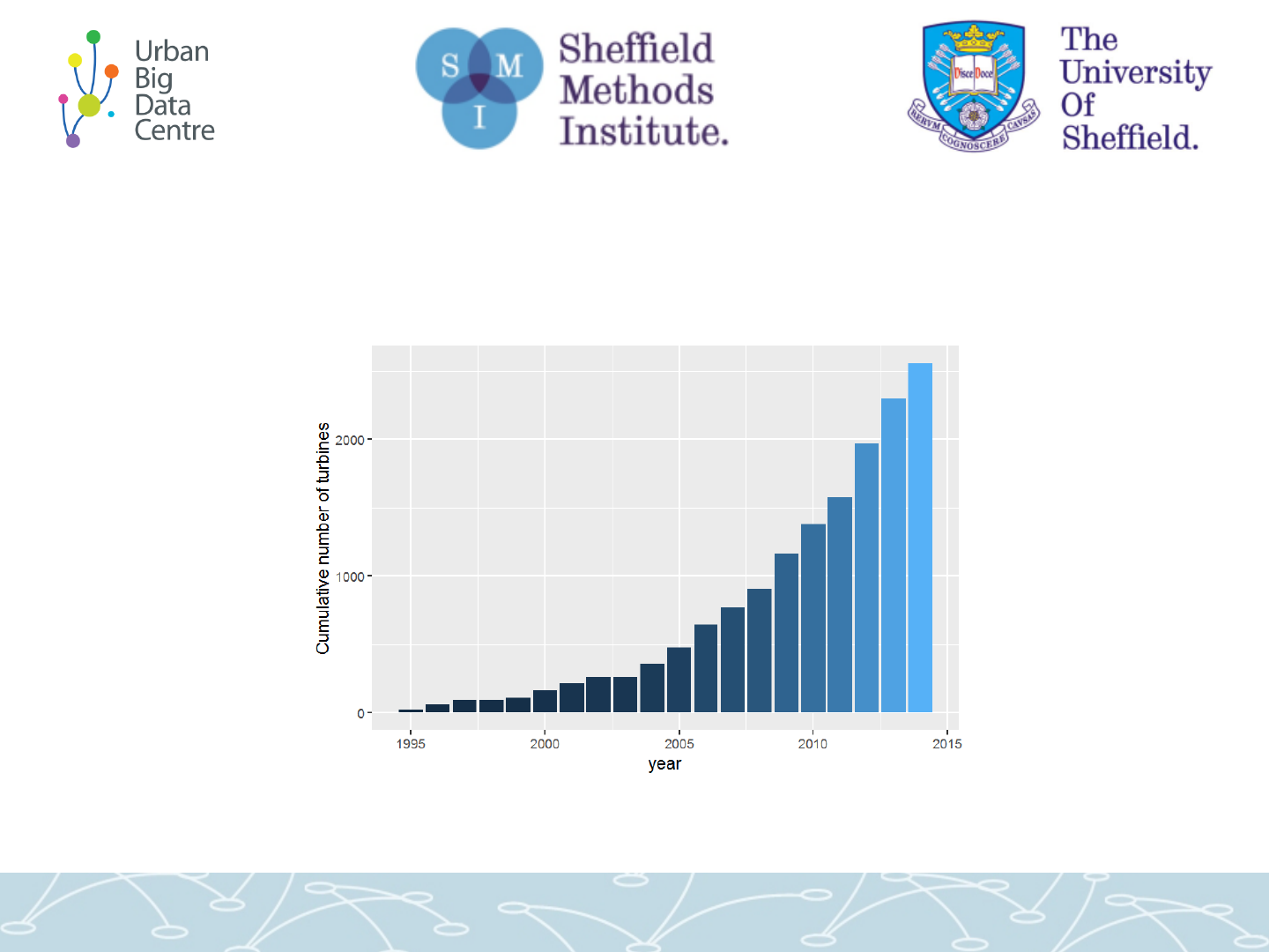
Cumulative no of turbines ’95-’15
RoS: property sales 1990 - 2014
% diff in house price (terrain)
• Diff in diff
• Little/ no
significant
difference
• Some
positive /
some neg
% diff in house price inc. building heights

… then a couple of extra wind-
farm related bits
looking at overall exposure to
wind turbines…

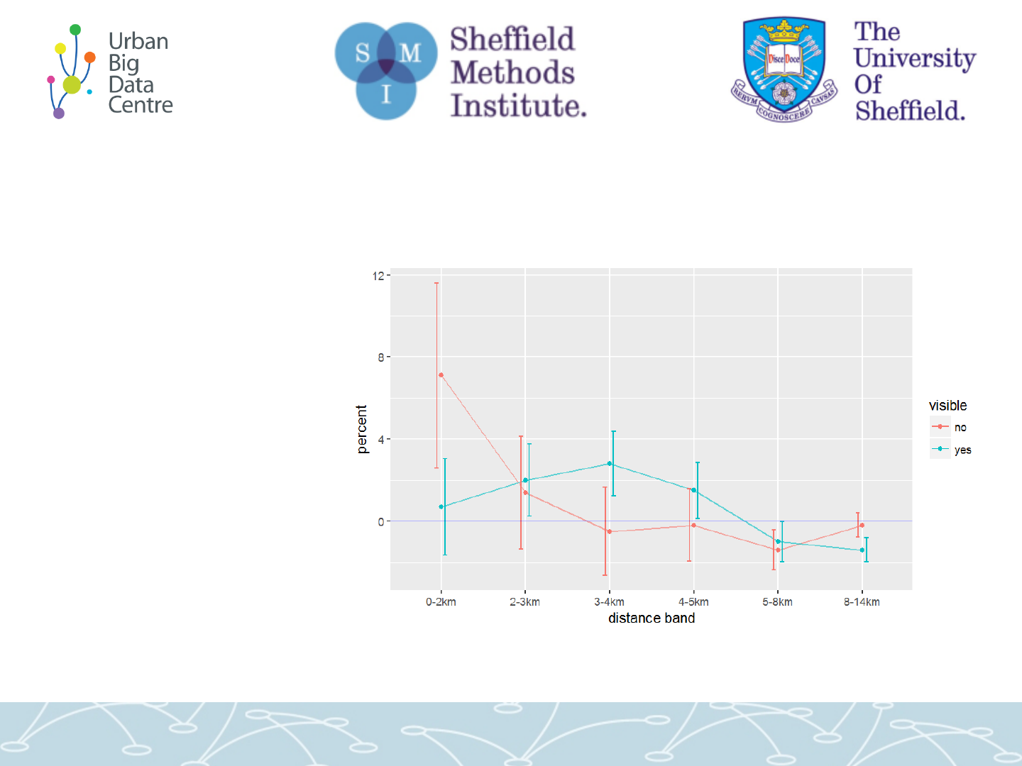
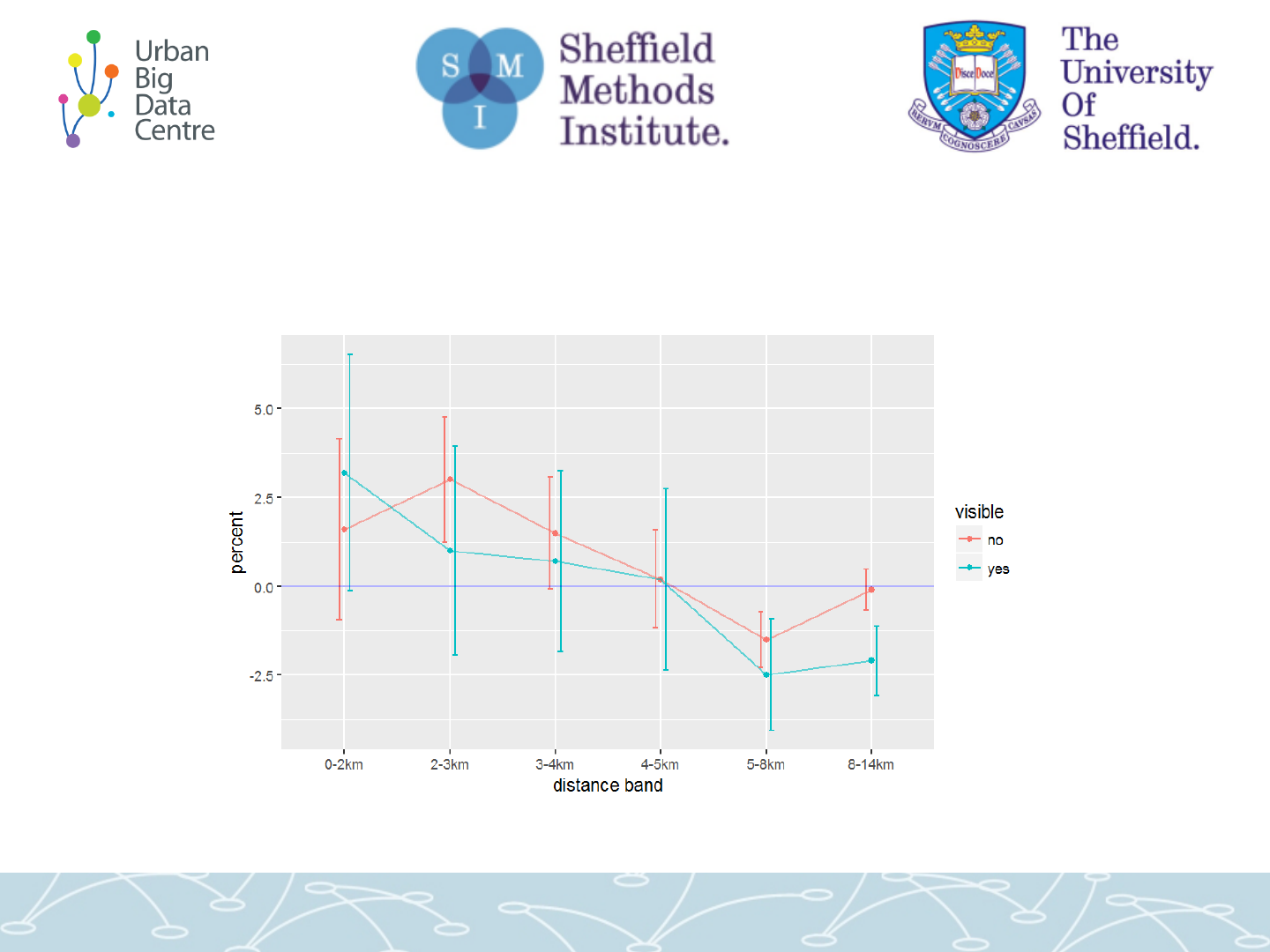
Exposure to turbine visibility
• We can ask:
what’s the difference in exposure to wind
turbine visibility for particular regions?
• For distance / terrain / accounting for building
heights: what percent of houses have at least
one turbine in each distance bin?
• Possibly: think of ‘terrain’ as ‘can I see turbine
from my area if not my house’
(Example of high visibility past buildings)
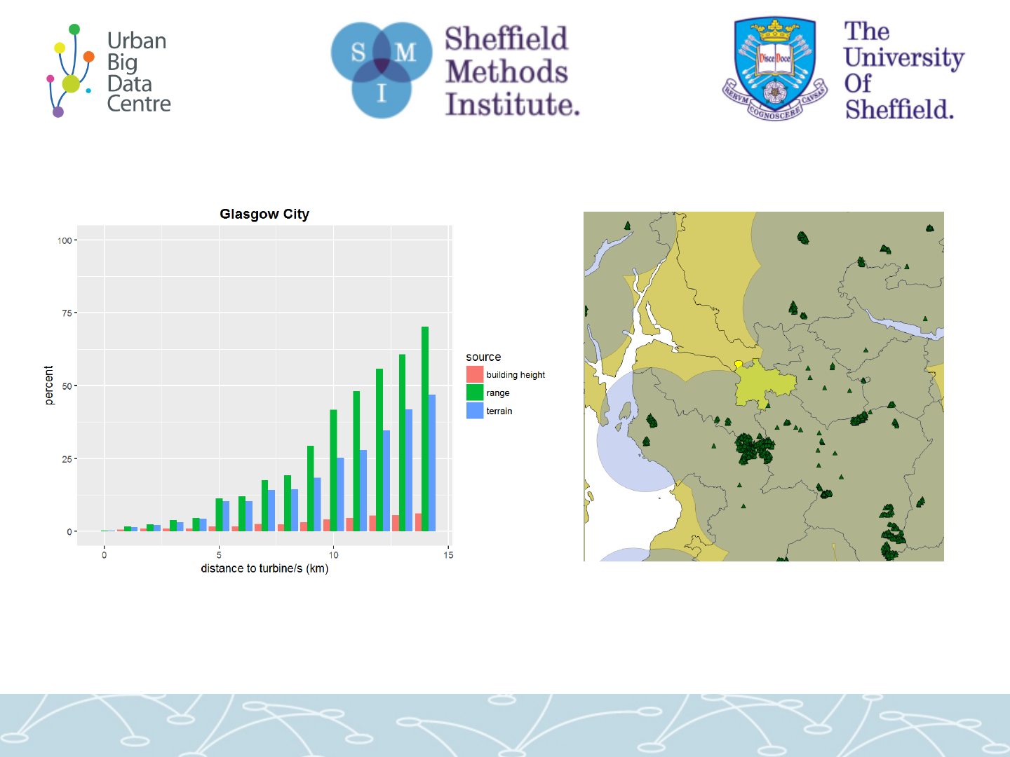
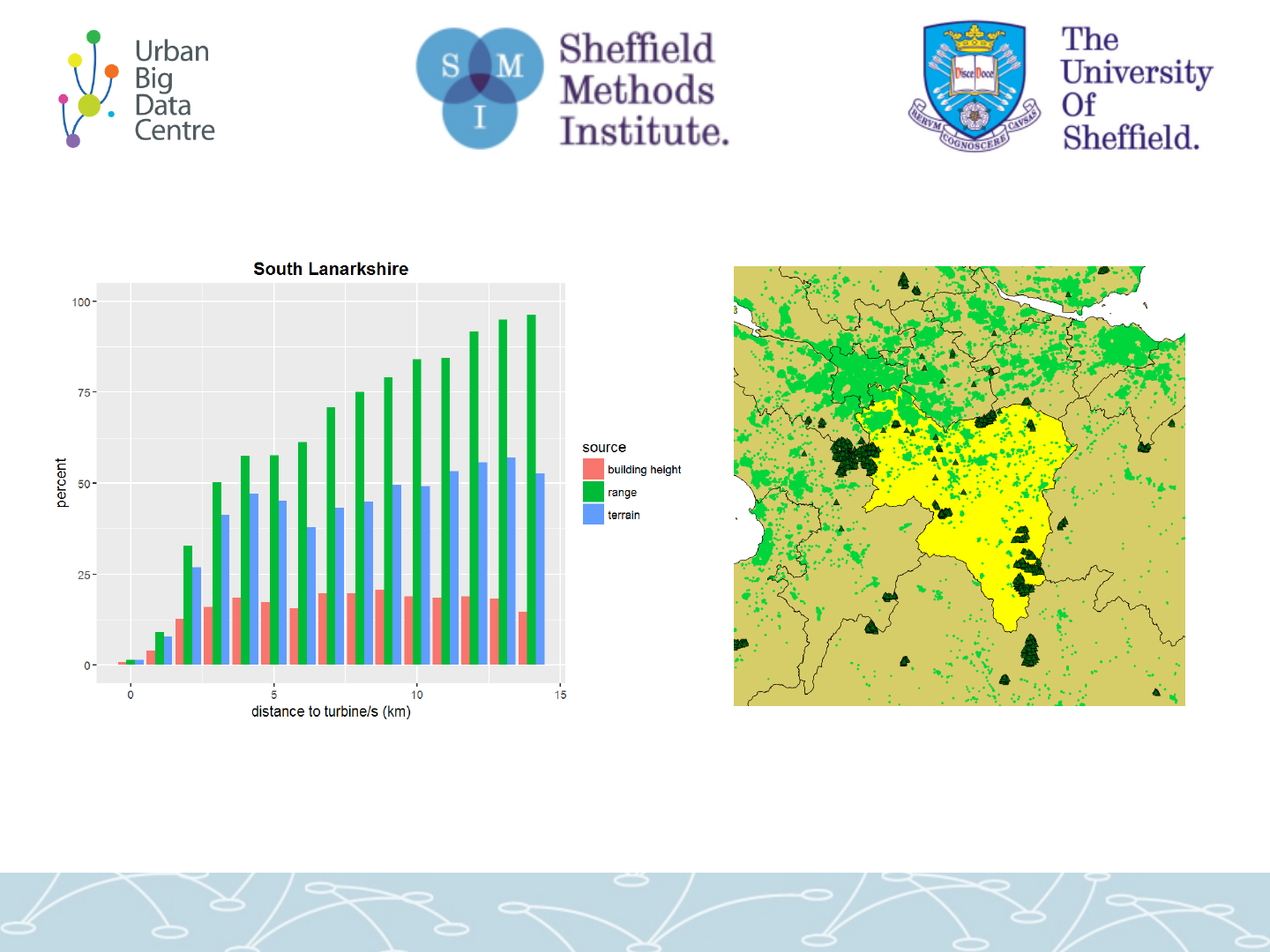
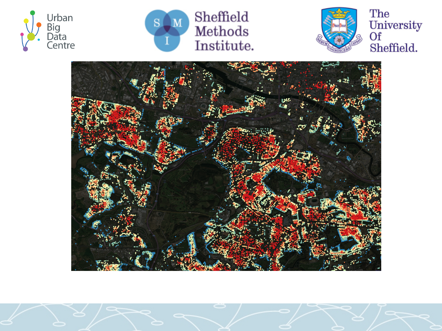
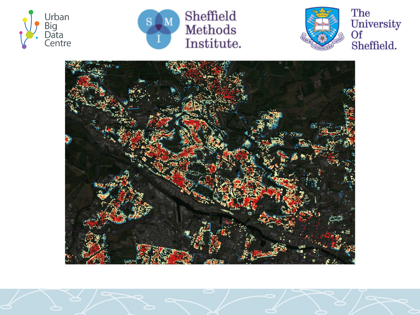
Glasgow: showing typical urban pattern
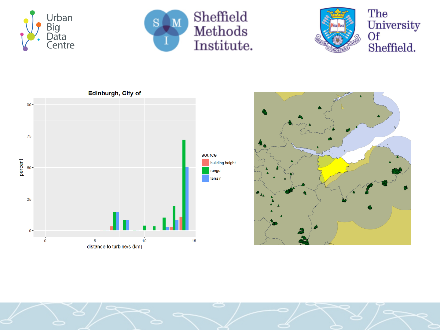
Edinburgh: much lower exposure

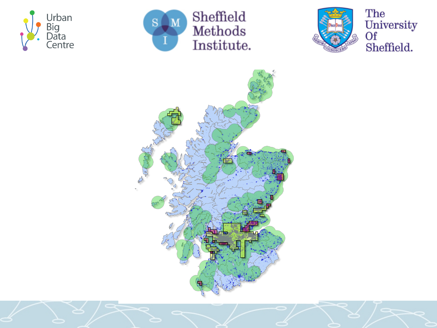
Are poorer areas more
“exposed” to wind farms?
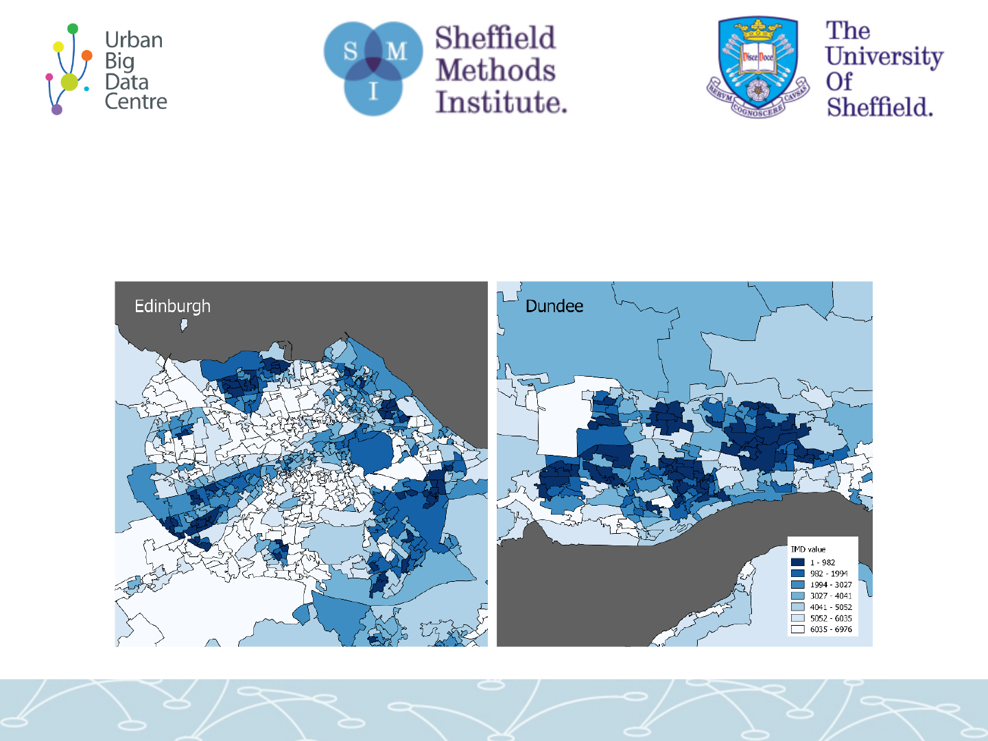
Comparing line of sight with
Scottish Index of Multiple Deprivation (SIMD)
SIMD darker zones / lower values are more deprived, higher values less

Following graphs
• All Scotland’s SIMD zones into equal sized
groups, more deprived on left
• For 3 distance bands:
– What percentage of each group’s zones have
80% or more properties that can see a
turbine?
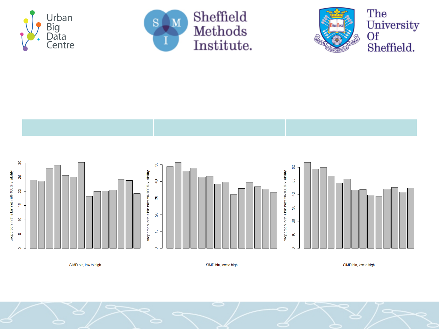
SIMD vs turbine visibility (terrain)
0 to 5km 5 to 10km 10 to 15km
Overall: declining -> less deprived areas are less exposed
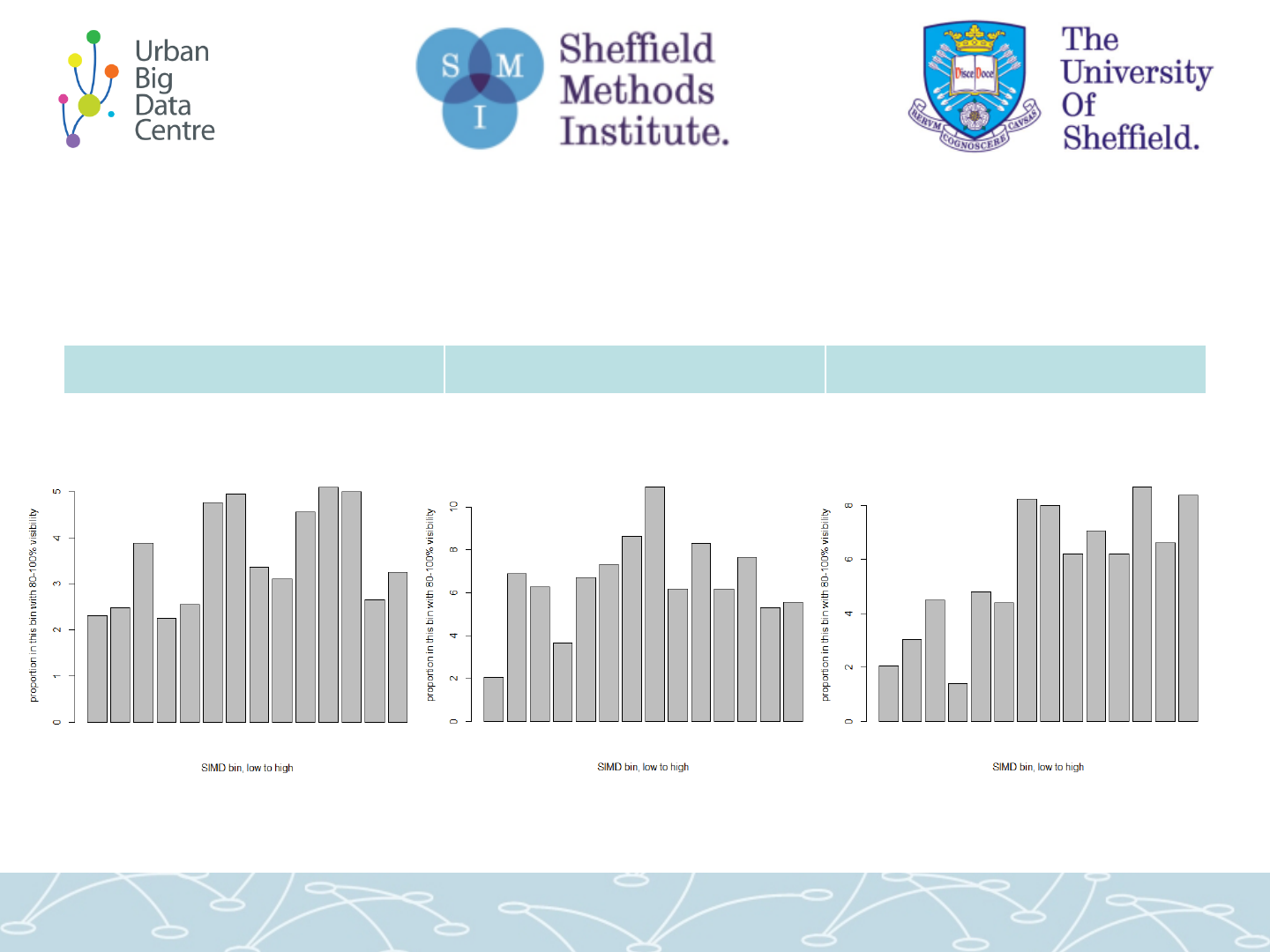
SIMD vs turbine visibility (building height)
0 to 5km 5 to 10km 10 to 15km
Overall: increasing?? Mixed? -> poss. more deprived areas are less exposed
.... Urban / rural difference?

2. GREEN SPACE

Green space...
• For all kinds of “green space”: parks, moors, grass
verges, gardens…
• How much green space can properties see?
– Starting with Glasgow: using all Glasgow properties we have
price data for (~152,000)
• Different approach needed from wind farm analysis...

3 sources of green
space data...
Mastermap Green Space: highly detailed but ends at city edge
Open Greenspace (gives park names plus extra)
Digimap land use cover (minus a few)
• GREEN SPACE LINE OF
SIGHT:
• To make computationally
manageable...
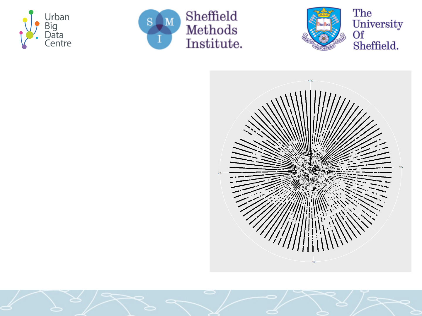
• For each property, find 100 lines
of sight around the compass
• Get record of all green space
out to 15km
• Along each: 500 points, 30
metres apart (15000 points per
property in total)
• This example: typical city centre
property – black marks = green
space within range (not nec. visible)
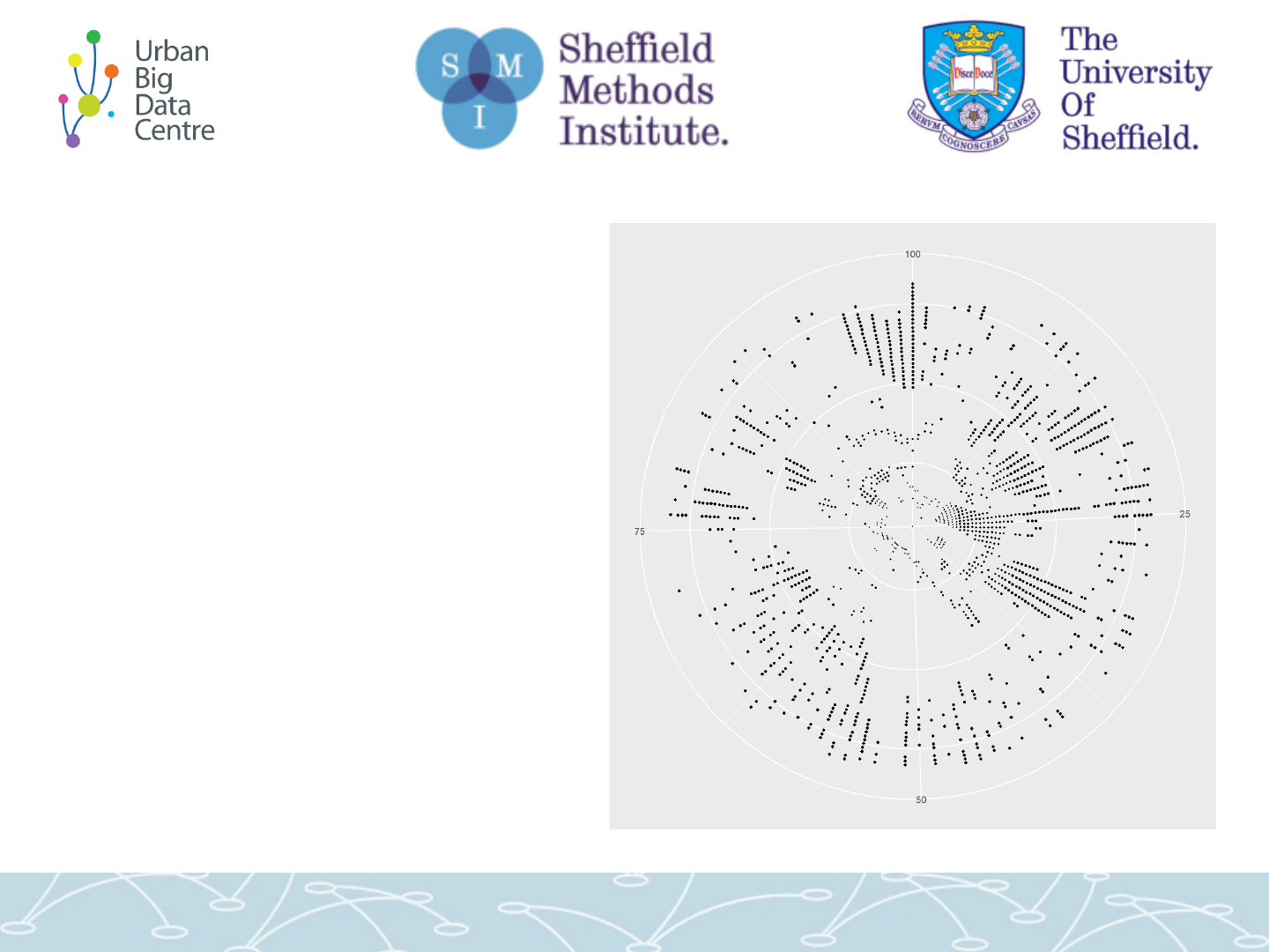
• Zooming in...
• Same city centre
property up to 2km

• Then run the green space viz model for all
Glasgow properties...
• Maps of overall green space visibility for
Glasgow
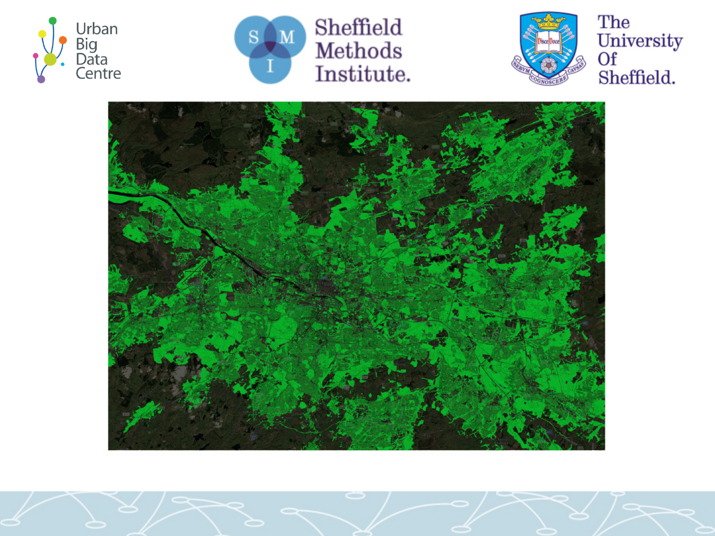
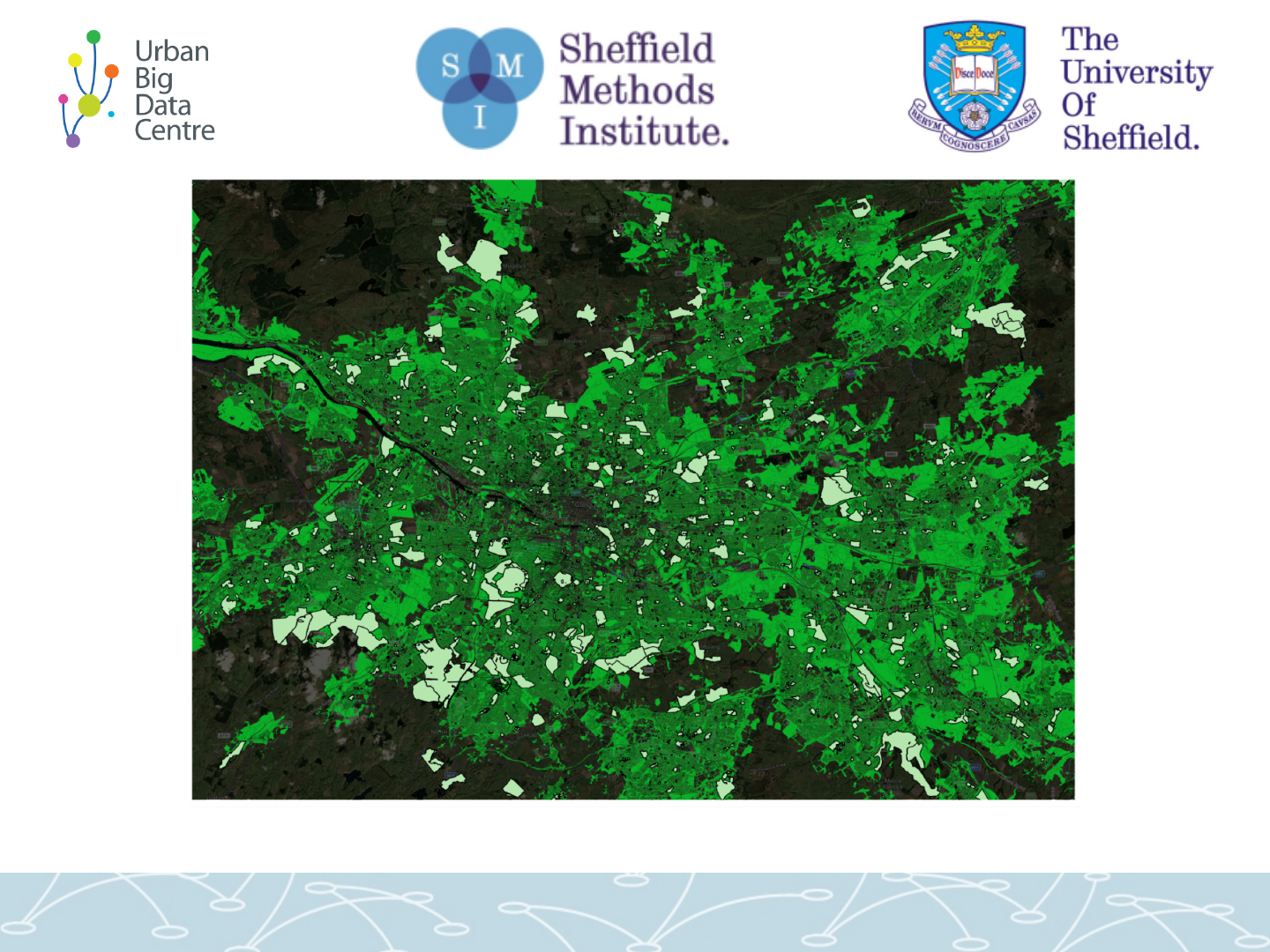
Total (0 to 15km) visibility per property:
blue = highest %, red = lowest %
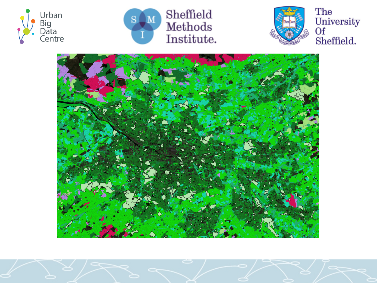
0 to 500m visibility per property:
blue = highest %, red = lowest %
Number of highest viz properties now closer to city centre
Zooming in on 0-500m. Blue: highest percent. Red: lowest.
Showing properties bordering parks with highest % visibility (phew...)
0-500m again: many places with low local visibility...
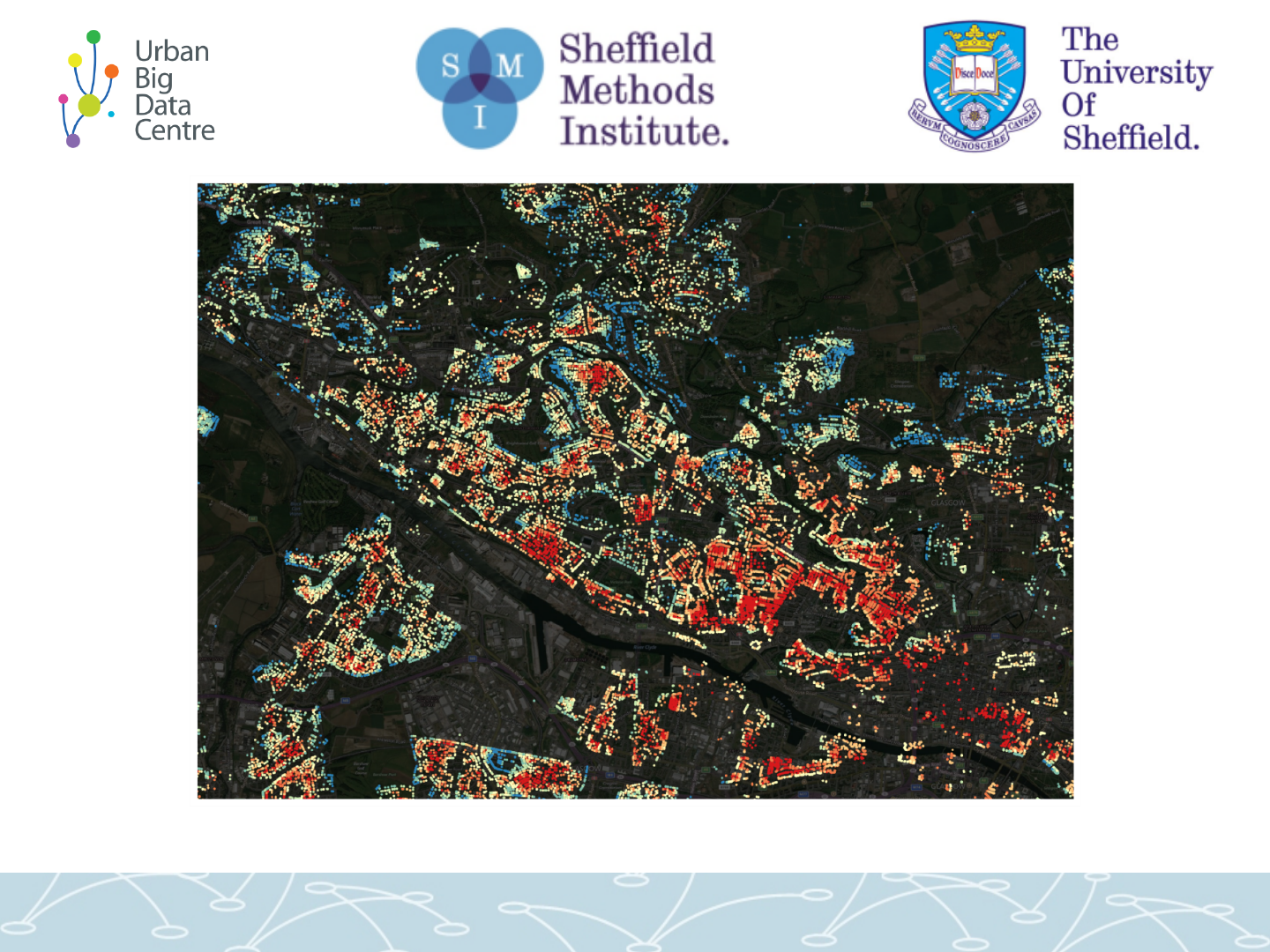
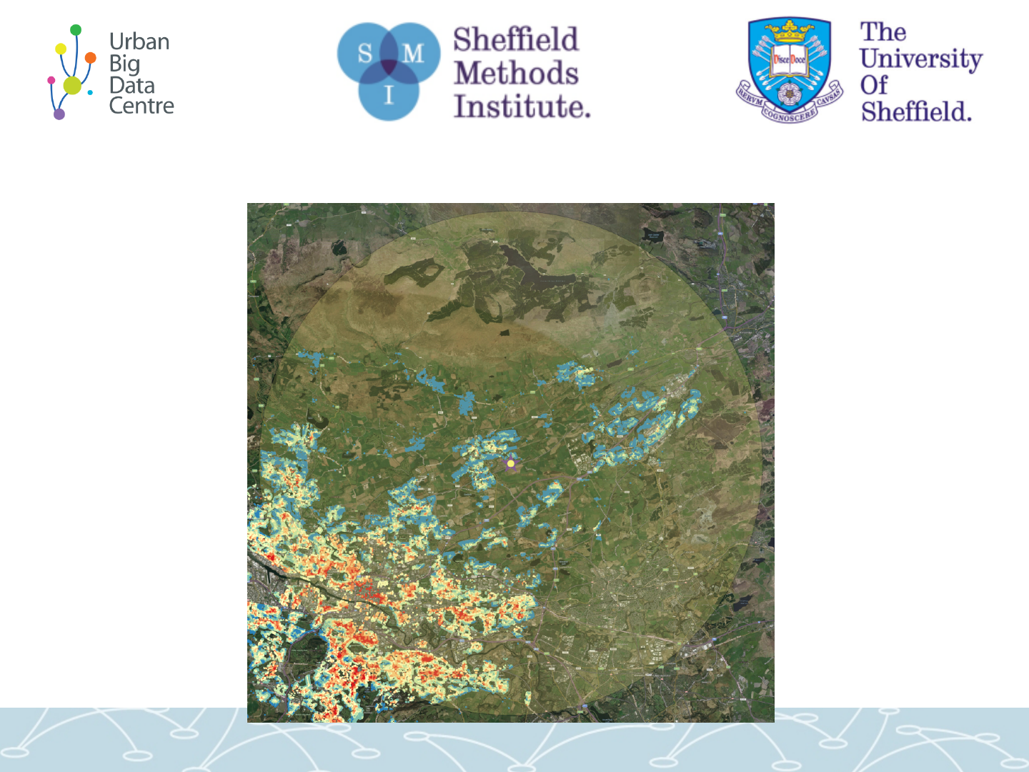
Now 0 to 15km ... Some of those have good long-distance viz.
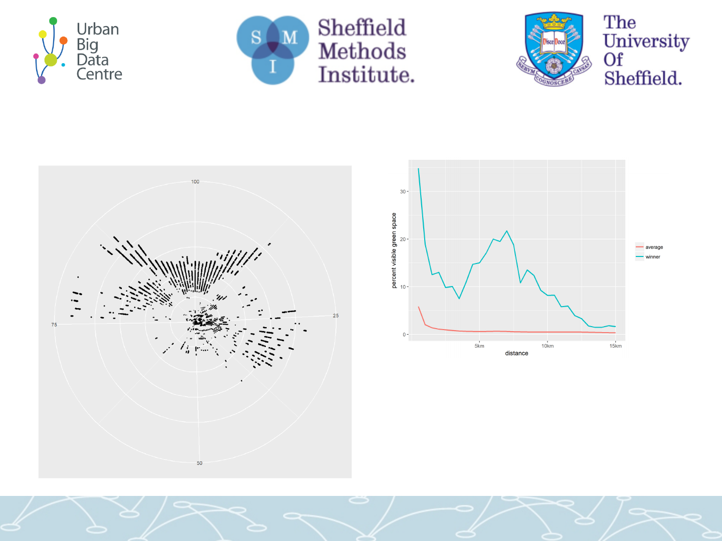
What’s the urban property with the best view?
• Graph above: percent of entire view
radius that sees green space, in 500m
bins up to 15km
• red line = average for all properties.
• Blue is the current % winner
(excluding rural properties)

Which is... South side of Kirkintilloch
Thanks!
Questions...?
Windfarm report:
www.climatexchange.org.uk/reducing-emissions/impact-
wind-farms-property-prices
d.olner@sheffield.ac.uk
@DanOlner