Yorkshire and The Humber: growth slope plots for ITL3s (November 2025)
INTRODUCTION
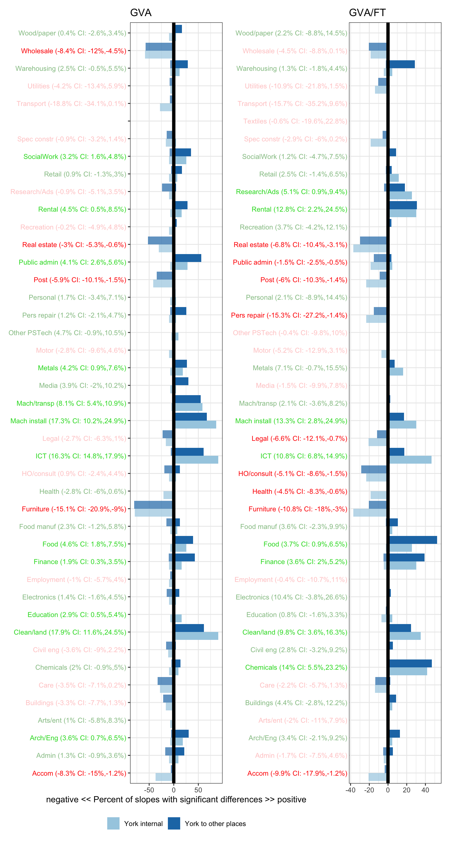
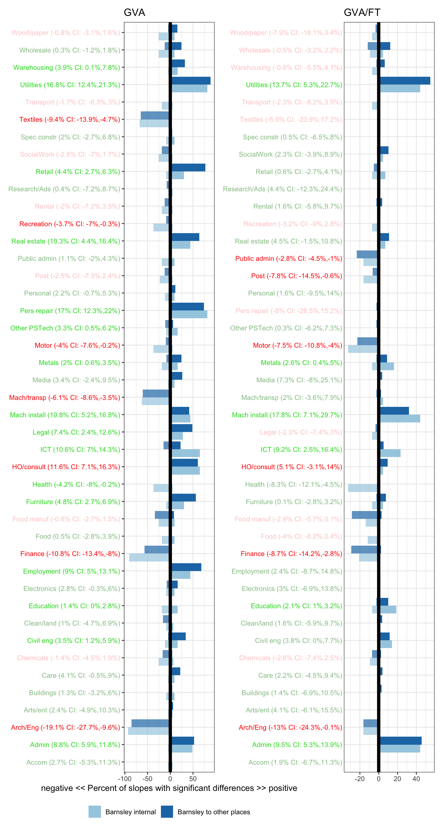
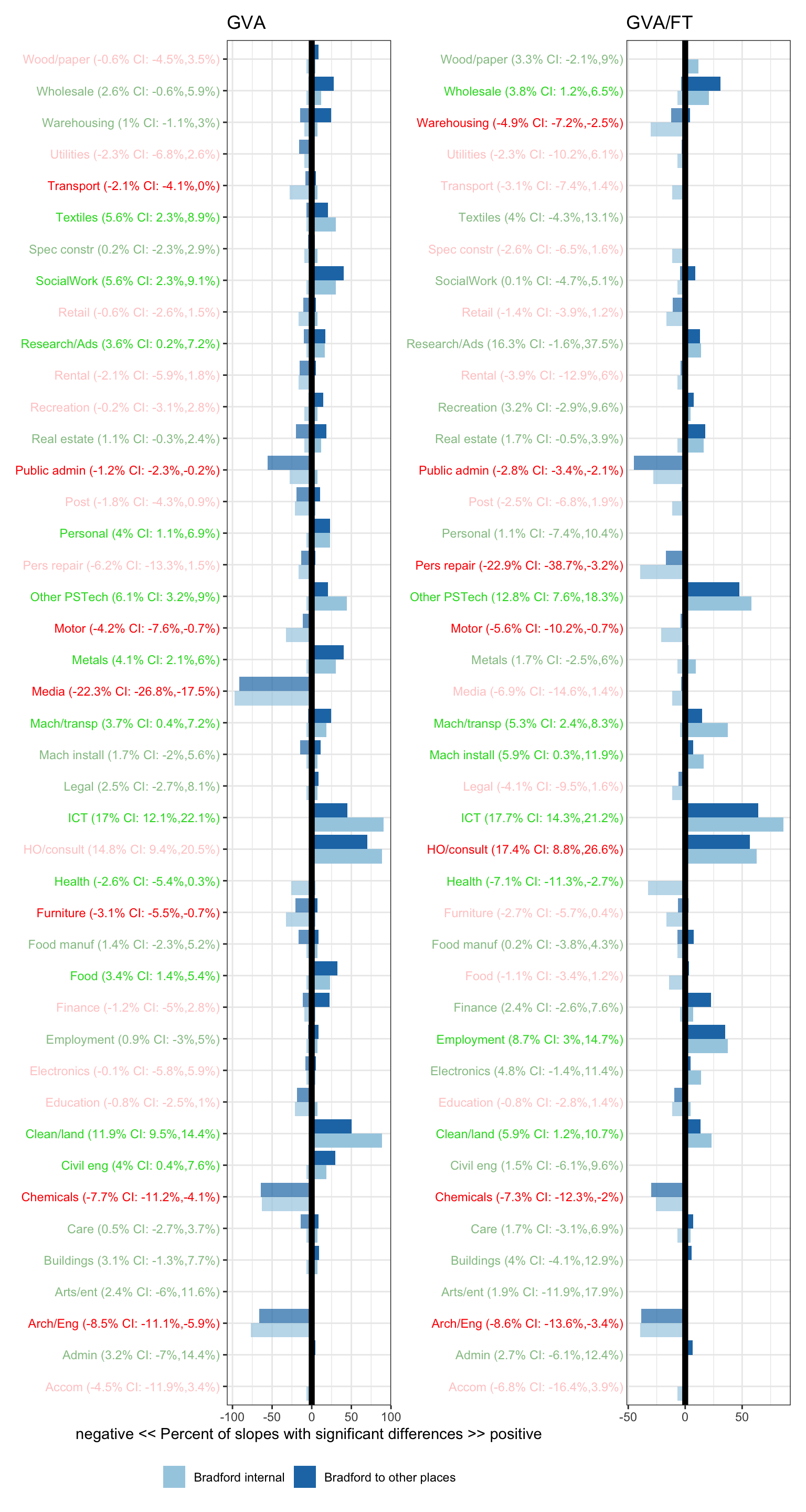
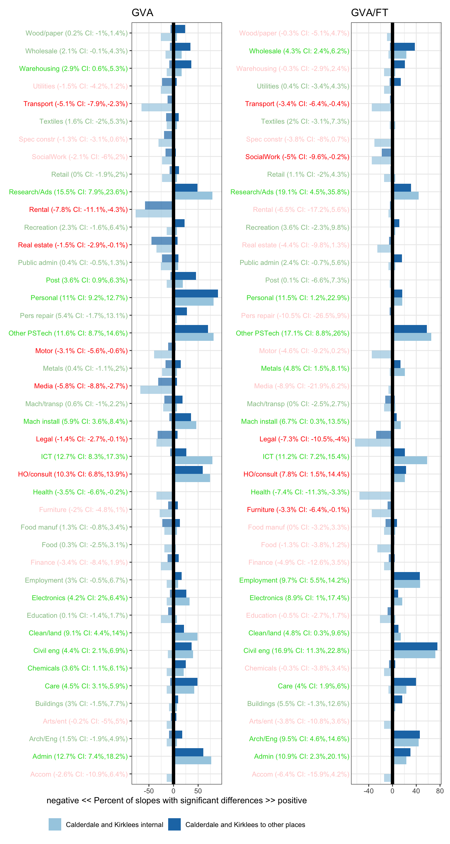
This page has growth trend plots for each ITL3 in Yorkshire and Humber for GVA and GVA per full time job (a productivity measure) (both using the 46 sector categories available in the GVA data). These are done for the full range of data - 2015 to 2023.
Here’s an explanation of what’s in the plots below.
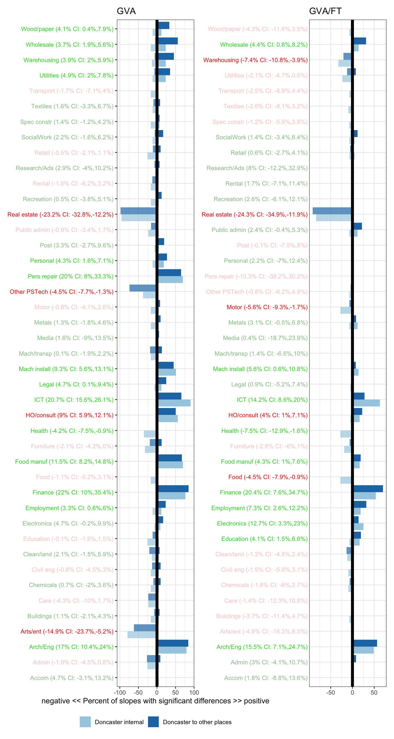
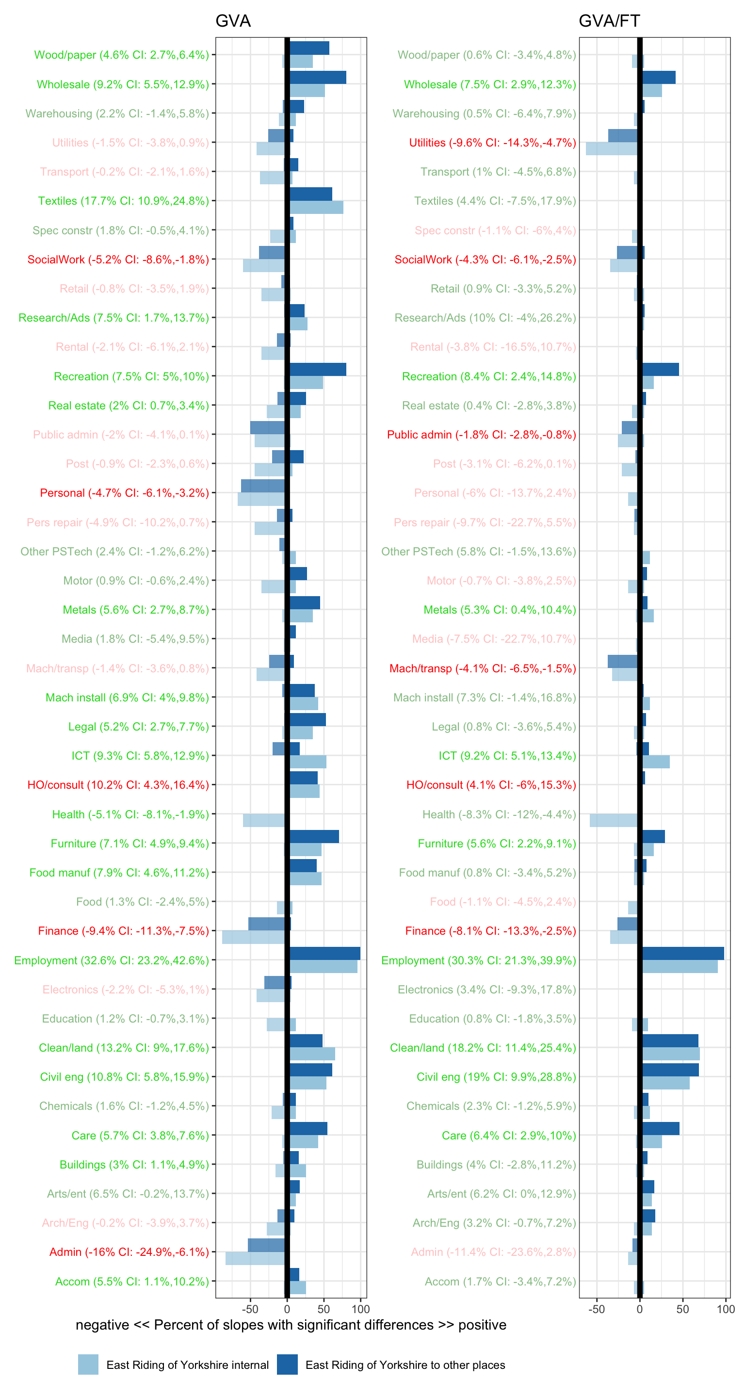
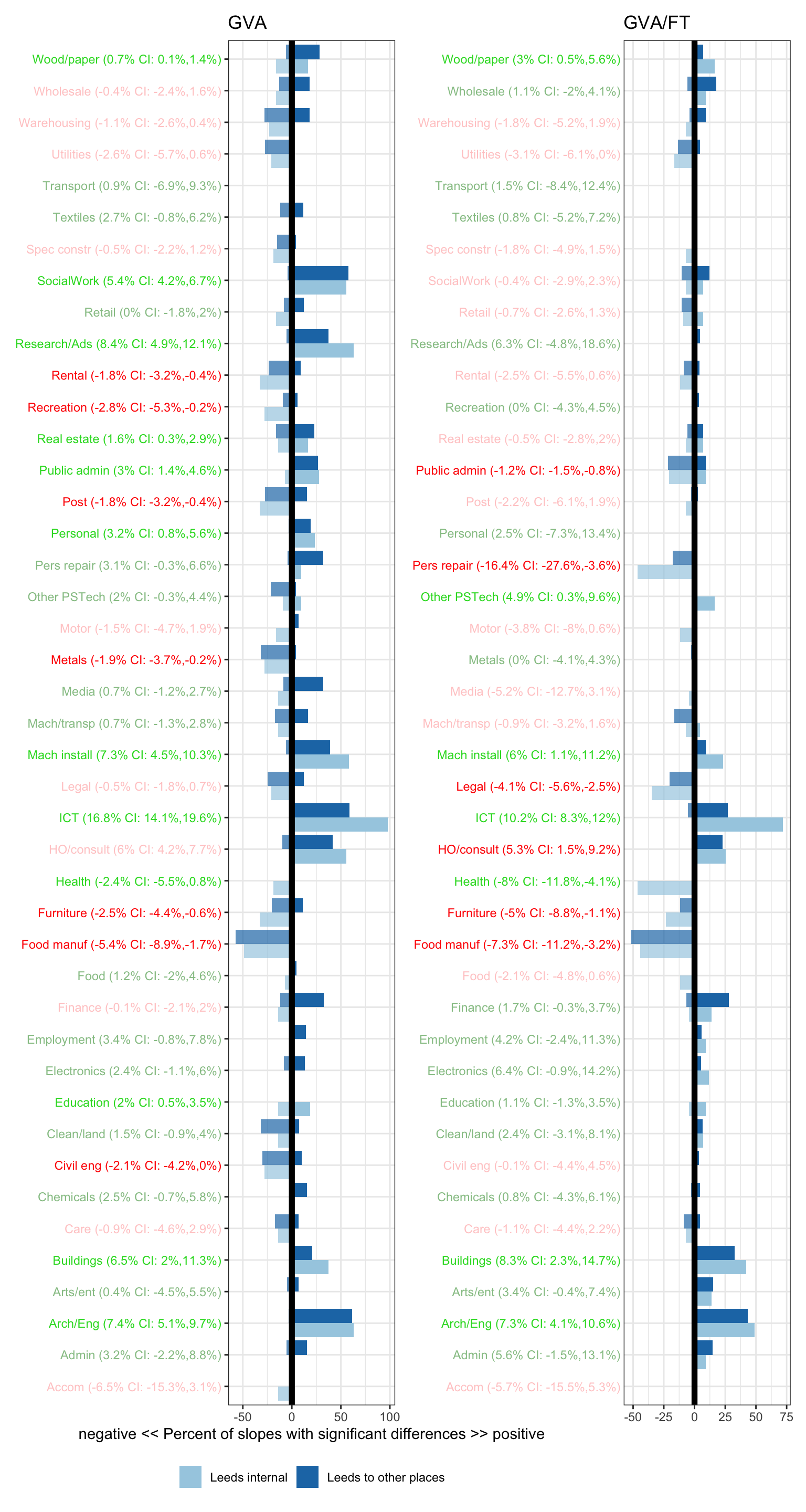
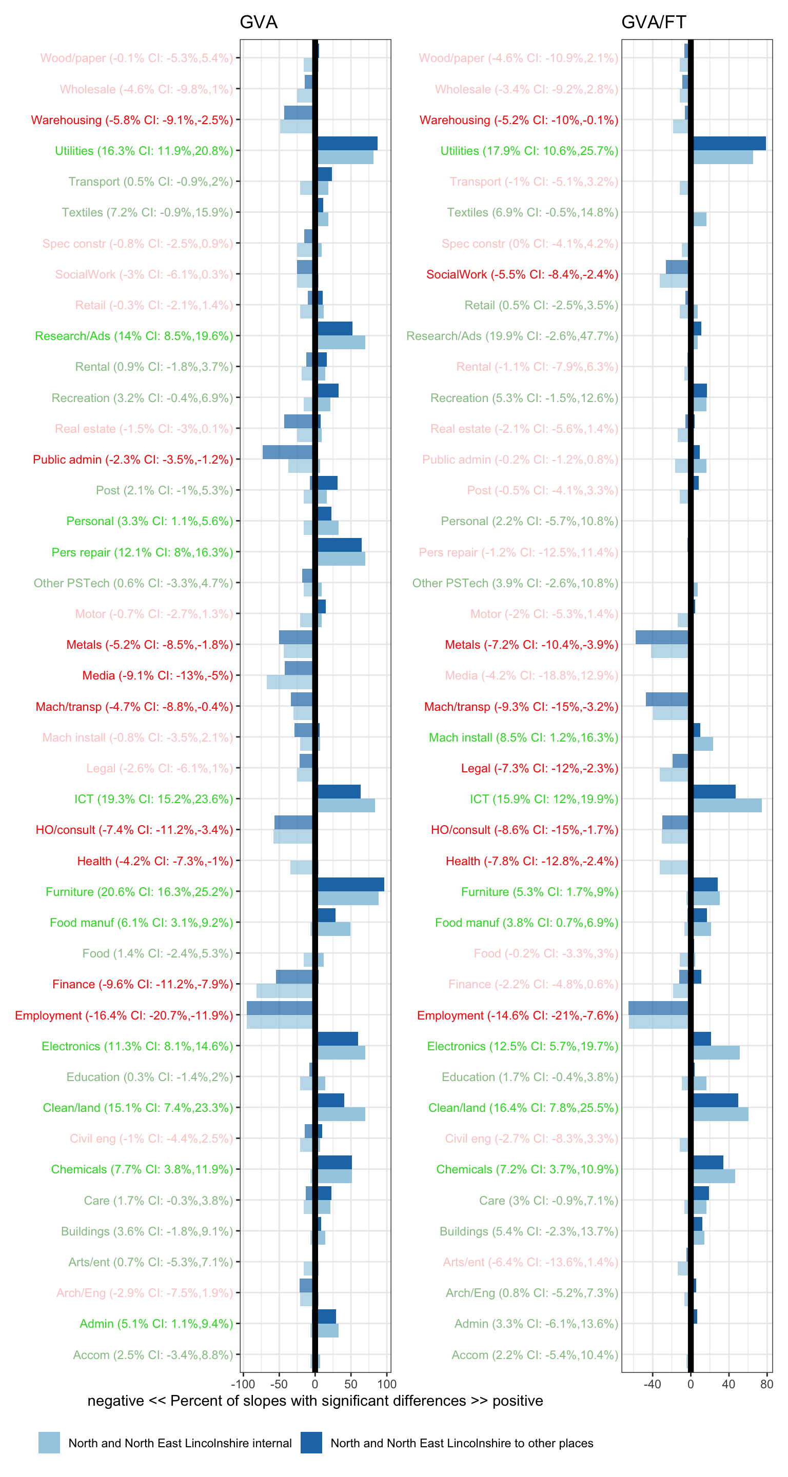
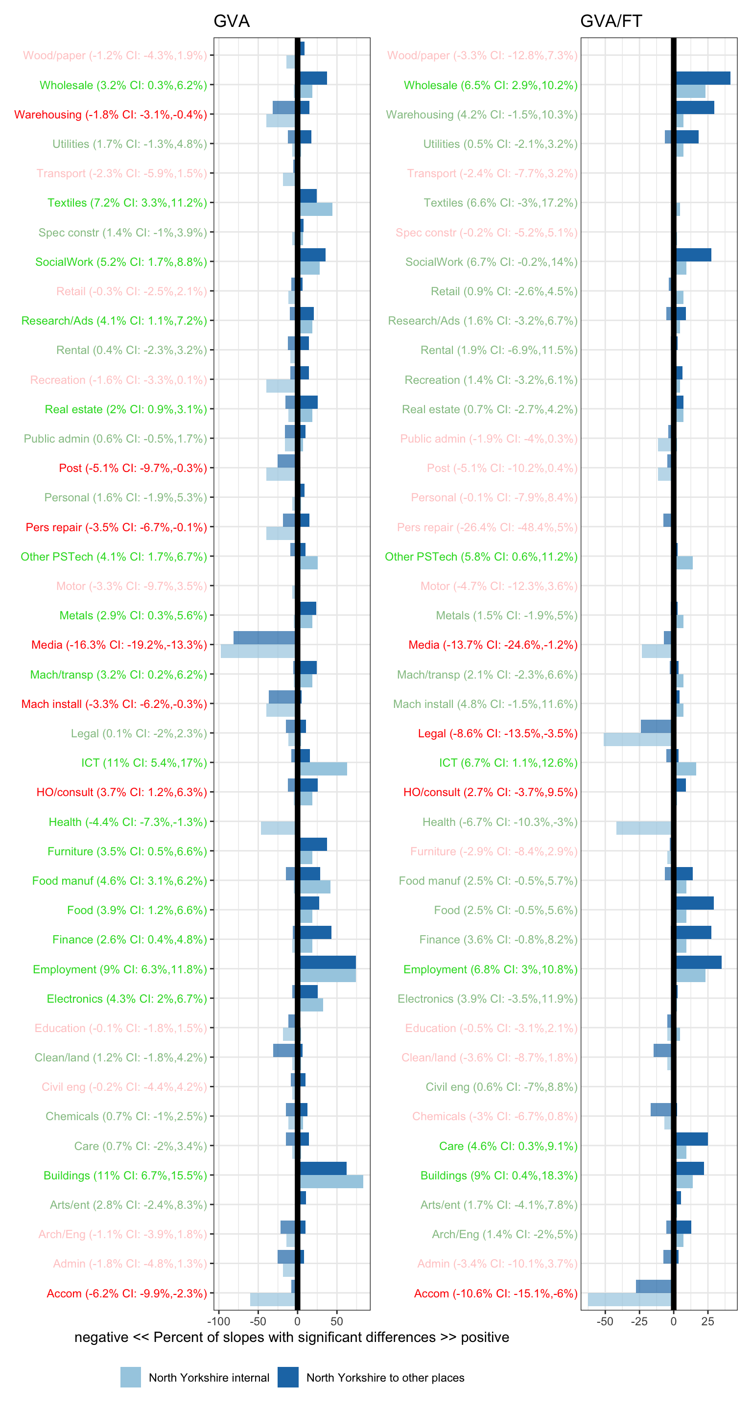
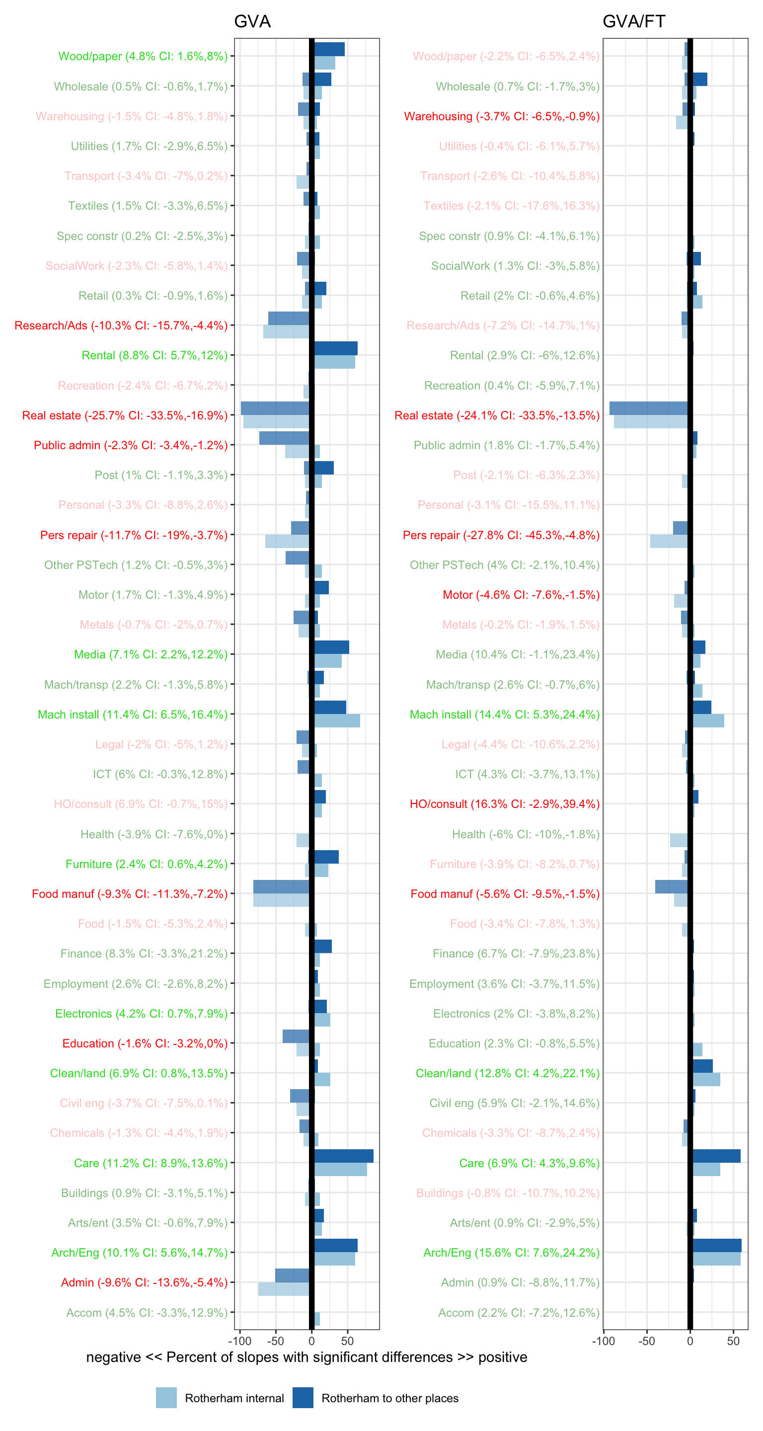
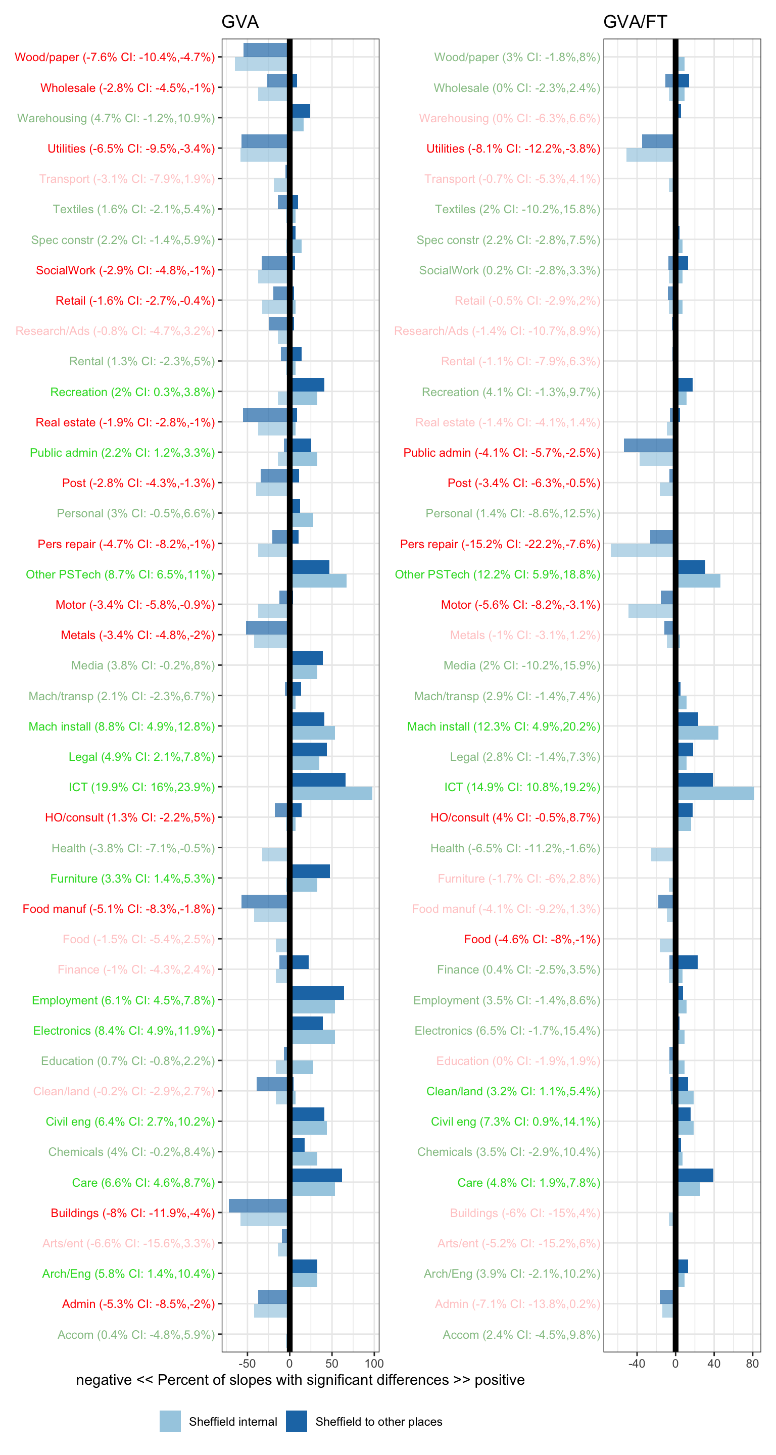
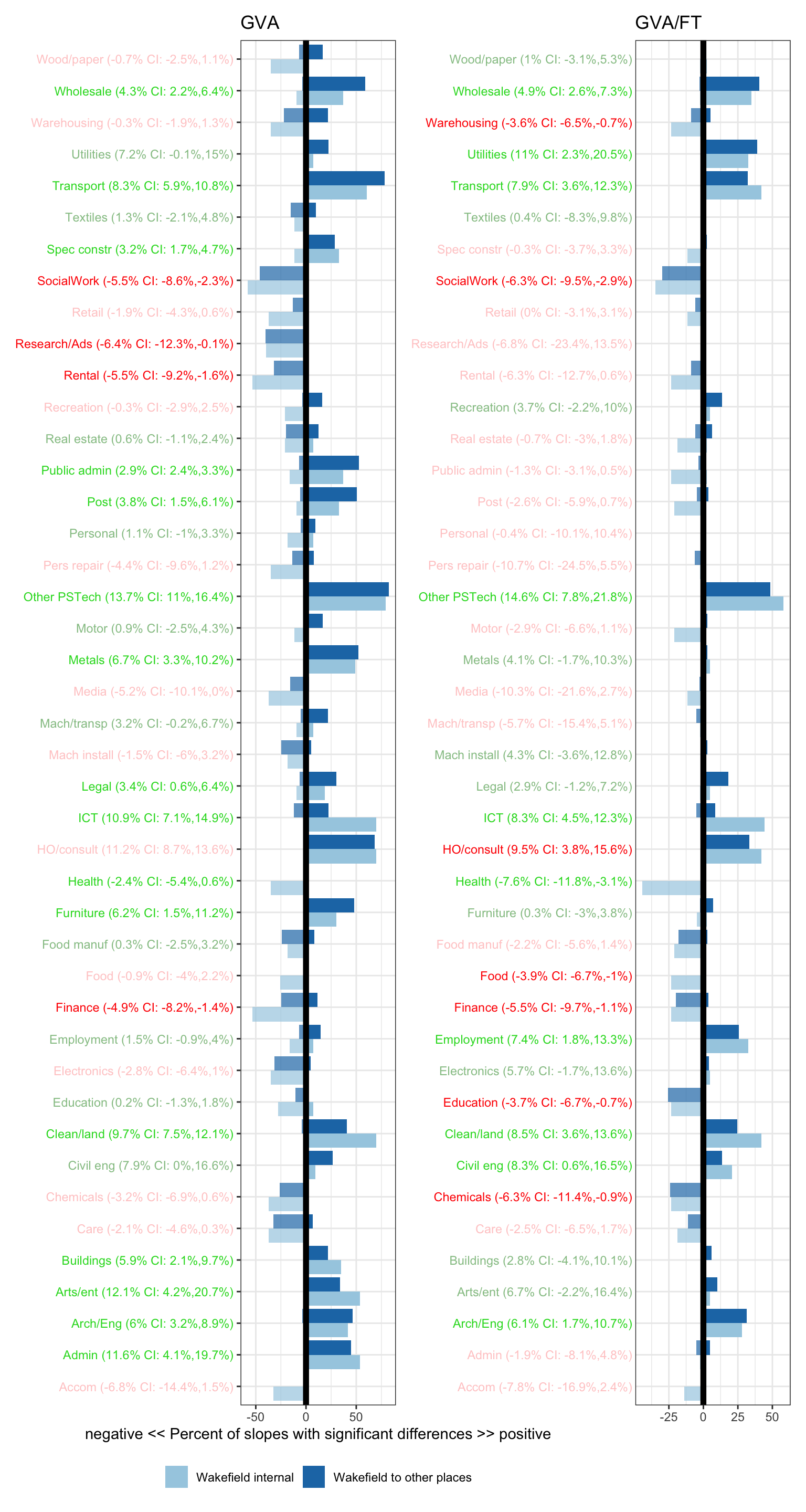
- Linear slopes are found for each sector in each place, and each is compared to (a) all other sectors in that place (“… internal”, light blue) and (b) the same sector in all other ITL3s zones in the data (“… to other places”, dark blue).
- For example - looking at one stand-out sector in the first plot for Barnsley: utilities. Its GVA has grown significantly more than around 75% of other sectors in Barnsley, and significantly more than around 75% of that sector in other ITL3 zones. Its productivity (measured in GVA per full time job) has grown equally significantly (higher than around 47% of other ITL3s).
- The x axis gives the percent of slopes that are significantly different to others (i.e. 95% confidence intervals don’t overlap).
- The vertical axis lists all sectors in alphabetical order. These labels given information about the absolute growth trends for sectors in each place - i.e. whether they have on average been sloping up or down over the whole time period, irrespective of whether significantly higher or lower than other places:
- Green text: slope rises over time - growth is on average going up
- Red: slope drops over time - growth is on average going down
- Bold green and red: the up or down slope is significantly different from zero (faded red and green can’t be statitically separated from no change over time).
- Text after the sector name is percent change per year on average with 95% confidence intervals.
So:
- To see whether a sector has been growing or shrinking overall, use the sector text (green for growth, red for shrinkage, values given for average % change per year)
- To compare that sector’s trend with other sectors in each place or the same sector in other places, use the bars in the plot. Note - these are relative: a slope could be relatively more positive than another, but the sector overall could still be shrinking. For example, ICT has been growing strongly in most places in the UK - but is growth in one place significantly stronger than others? That’s what the place and sector slope comparisons try to answer.
Barnsley
Bradford
Calderdale and Kirklees
Doncaster
East Riding of Yorkshire
Leeds
North and North East Lincolnshire
North Yorkshire
Rotherham
Sheffield
Wakefield
York