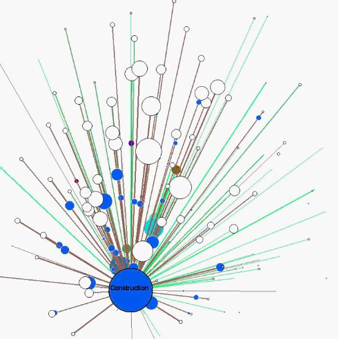
This is one of the fun things I coded up in the process of developing the last grant I worked on. I’ll explain a bit about it and then share some thoughts on whether it’s any good as a visualisation. There’s a sharper HD version of this video here and a dist.zip file on the github page if you want a play.
Your standard input-output table takes a bunch of economic sectors and, in a matrix, gives the amounts of money flowing between each of them. For the UK, we’ve got ‘combined use’ matrices that include imported inputs moving between sectors, as well as domestic use only, excluding imports. (These two work with different types of prices, though, so they’re not directly comparable.)
This is the boiled-down version of the data I use, from the first data link above: the 2012 combined use matrix. Github gives you a scroll bar at the bottom to view the whole CSV file. The sector names are only in the first column, but they also apply to each column heading along the top. So, for example, the first number column starting with 2822: this is what ‘agriculture, hunting, related services’ spends on other sectors. So the first value is what agriculture spends on itself (it’s in millions of pounds; the matrix diagonal gives the amounts each sector spends on itself.) This is a tip from Anne Owen that’s always helped me: think of each column as a receipt of what that sector has bought. So summing the receipt gives you that sector’s total consumption. Summing each row gives you its total demand - how much others buy from it.
The visualisation shows what this matrix looks like if you stick it into a force-based layout and make each money flow a moving circle. The live version is interactive, allowing you to explore sector connections.
So: any good as a visualisation? Before I’d produced it, I would have said, mmmm - not really. It’s fun to play with but doesn’t really convey information. It does manage to give a quick overview of the relative size of sectors and how much money moves between them, but you can’t ask it any useful quantitative questions. I’ve since learned a lot more about the internal structure of these IO matrices using R - perhaps that’s something I’ll come back to. I have also coded a ‘random walk centrality’ test (that code is in the source files, though it’s turned off at present) - so it’s certainly possible to use the network structure to do some analysis.
Something unexpected happened with this visualisation, though. It engaged people. Prior to this, I probably wouldn’t have thought that was an important thing but, looking back, having something like this that’s able to draw someone in - that’s turned out to be very useful. One of my colleagues used it in a tutorial and apparently they were really taken by it.
That kind of initial hook can be enough to make someone want to find out more. That’s been a useful lesson for me. If I were drawing up a criteria list for successful visualisations, this one’s made me think of adding ‘engagement value’ or ‘hook power’ or somesuch. This IO viz has plenty of that. I think it manages to give an impression of the economy as a whole that would otherwise be hard to see. (Though there are reasons to distrust the picture it paints: it tells you construction is by far the biggest sector - it wasn’t until 2013, when ONS took three separate construction sectors and combined them.)
But another visualisation criteria should, of course, be ‘does it communicate information effectively?’ This doesn’t manage so well. Perhaps the ideal is to maximise communication / information / hookiness. Perhaps there’s a trade-off there too - making something that might initially make a person go ‘wooooo’ will probably mean, after a few minutes, they’ll realise it’s a bit meaningless.
Even so: prior to this, it would never have occurred to me that hookiness could be useful in itself. For the grant, this viz helped me say: “look, these are the money flows moving in the UK. We want to want to know where in the UK they move”.
This is also a good example of why I still like Java. There’s a lot of work going on there - it would likely run unuseably slow in javascript. This takes us straight back to the ‘wooo/information’ trade-off though. One might argue the computationally intense stuff it’s doing is useless for conveying information - and including it, insisting on a more powerful codebase, is cutting it off from an easily accessible home on the web.
