library(tidyverse)
library(sf)#for geo stuff
library(tmap)#for mapping
library(zoo)#for making smoothed moving averages
library(patchwork)#combine ggplots easily
library(plotly)#For interactive plots

source('functions/misc_functions.R')

#Set ggplot theme
theme_set(theme_light())Intro to using ONS GVA and jobs data in R
This page runs through some R-code examples of ways to examine the pre-baked ONS GVA and jobs data from here, which has been processed/linked to help smooth the path to getting GVA and jobs insights.
As well as base R and ggplot, it also uses a few bespoke functions written to analyse/visualise this data; these are all available in the project repo, in the misc_functions.R script.
A quick way to use all this is to clone the repo or download directly from github with the green ‘code’ button on the main repo page / ‘download zip’. Though all data used below loads directly from URLs, so don’t require it to be downloaded locally.
As the pre-bake page says, we’ve got the following to work with:
- GVA data at ITL2 and 3 geographies, broken down by SIC industrial codes at 2-digit, Section (20 categories) and Production/Construction/Services, 1998 to most recent available year.
- BRES job count data for the same (though with slightly more SIC codes), with a little bit better job count resolution than the originals (see above post for why/how).
- A linked version that combines those two, so we can dig into GVA per job across Great Britain1.
- A couple of lookup tables for the ONS’ bespoke SIC codes for their regional GVA data.
These are both rich datasets (though it’s worth exploring how the reginal GVA data is made to get a sense of its issues). Here, we’ll just run through a range of examples to show how to get started with digging into them.
See the left hand bar for other ways to use them, including a deeper dive into location quotients / proportion plots, and into GVA gap analysis.
Please let me know if you have any thoughts, ideas or code on other analyses to add etc, via the github issues or email danolner at gmail dot com).
Here’s some libraries, and the functions inside this repo we’ll use.
Two quick examples to get started
Just using ggplot, let’s first look at how a single ITL2 zone’s broad sectors have changed over time. We’ll use a 3 year moving average using the zoo library to make the trends easier to discern, and pick out the top 12 SIC sections by GVA in the most recent 3 years.
This uses chained volume data showing real-terms value change in these sectors.
itl2.sections.cv <- read_csv('https://raw.githubusercontent.com/DanOlner/RegionalEconomicTools/refs/heads/gh-pages/data/regionalGVA/regionalGVA_chainedvolume_ITL2_SIC_SECTION_LONG_2022.csv')

#Add moving average
#Set range of average - 3 years
smoothband = 3

#Find the average within each place and each sector in each place
#Year is already in order, so this will find 3 year moving av between consecutive years
itl2.sections.cv <- itl2.sections.cv %>%
  group_by(Region_name,SIC07_description) %>%
  mutate(
    gva_movingav = rollapply(value,smoothband,mean,align='center',fill=NA)
  ) %>%
  ungroup()

place = "Leicestershire, Rutland and Northamptonshire"

#top 12 sectors in latest year
top12sectors <- itl2.sections.cv %>%
  filter(
    Region_name == place,
    year == max(year) - 1#to get 3 year moving average value
    ) %>%
  arrange(-gva_movingav) %>%
  slice_head(n= 12) %>%
  select(SIC07_description) %>%
  pull()

#Plot!
ggplot(itl2.sections.cv %>%
         filter(
           Region_name == place,
           SIC07_description %in% top12sectors,
           !is.na(gva_movingav)#Remove NAs created by 3 year moving average
           ),
       aes(x = year, y = gva_movingav, colour = fct_reorder(SIC07_description,-gva_movingav) )) +
  geom_point() +
  geom_line() +
  scale_color_brewer(palette = 'Paired', direction = 1) +
  ylab('SIC GVA (chained volume) ') +
  theme(plot.title = element_text(face = 'bold')) +
  labs(colour = 'SIC section') +
  ggtitle(paste0(place, ' GVA over time\nTop 12 sectors by GVA in latest year\n(', smoothband,' year moving average)'))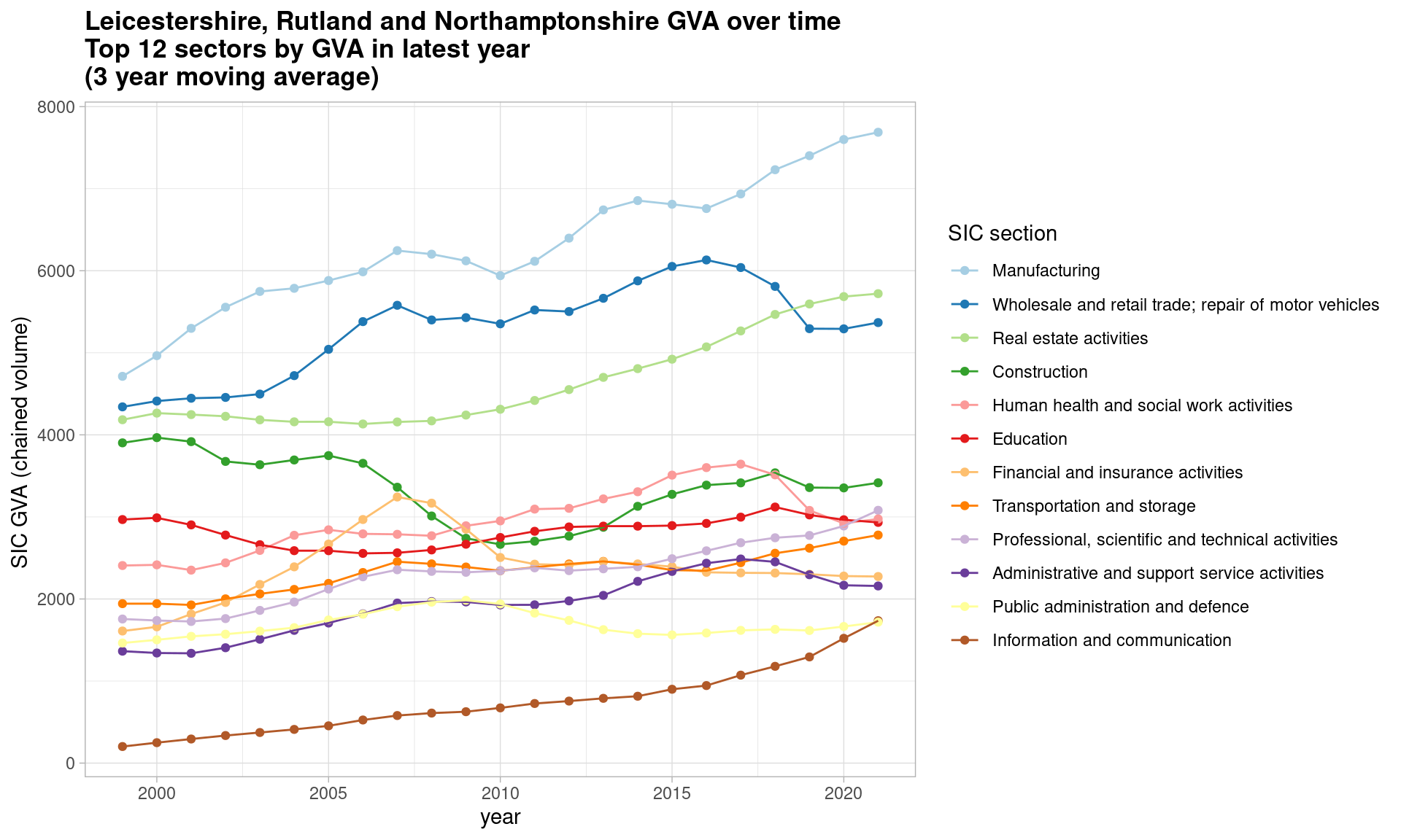
Second, using one of the joined GVA and BRES job count datasets, let’s see how GVA per full time job has changed over time for the UK’s core cities (minus Belfast, as BRES data is Great Britain only) within the manufacturing sectors.
Smoothed values are necessary here to discern a trend at all - the underlying BRES data samples are volatile. (Try this with gvaperFT to see…)
By this measure, there appears to be a slight convergence of manufacturing productivity in the core cities (though note how choice of productivity measure can affect gap analysis).
itl3.sections.cv <- read_csv('https://raw.githubusercontent.com/DanOlner/RegionalEconomicTools/refs/heads/gh-pages/data/regionalGVA_plus_BRESjobcounts/regionalGVA_plus_BRESjobcounts_chainedvolume_ITL3_SIC_SECTION_MINUSimputedrent_2022.csv')

#Get core cities and find moving average
corecities <- itl3.sections.cv %>%
  filter(
    GEOGRAPHY_NAME %in% c('Belfast','Birmingham','Bristol, City of','Cardiff and Vale of Glamorgan','Glasgow City','Leeds','Liverpool','Manchester','Nottingham','Sheffield','Tyneside')
  ) %>%
  group_by(ITL_code,SIC_CODE) %>%
  mutate(
    gvaperFT = gva / JOBCOUNT_FULLTIME,
    `gva/FT moving av` = rollapply(gvaperFT * 1000,smoothband,mean,align='center',fill=NA)
    ) %>%
  ungroup()


ggplot(corecities %>%
         filter(
           SIC07_description=="Manufacturing",
           !is.na(`gva/FT moving av`)
           ),
       aes(x = DATE, y = `gva/FT moving av`, colour = fct_reorder(GEOGRAPHY_NAME,-`gva/FT moving av`) )) +
  geom_point() +
  geom_line() +
  scale_color_brewer(palette = 'Paired', direction = 1) +
  ylab('GVA per FT job (3 year moving av) ') +
  theme(plot.title = element_text(face = 'bold')) +
  labs(colour = 'Core city') +
  ggtitle(paste0('Core cities GVA per FT job over time (', smoothband,' year moving average)'))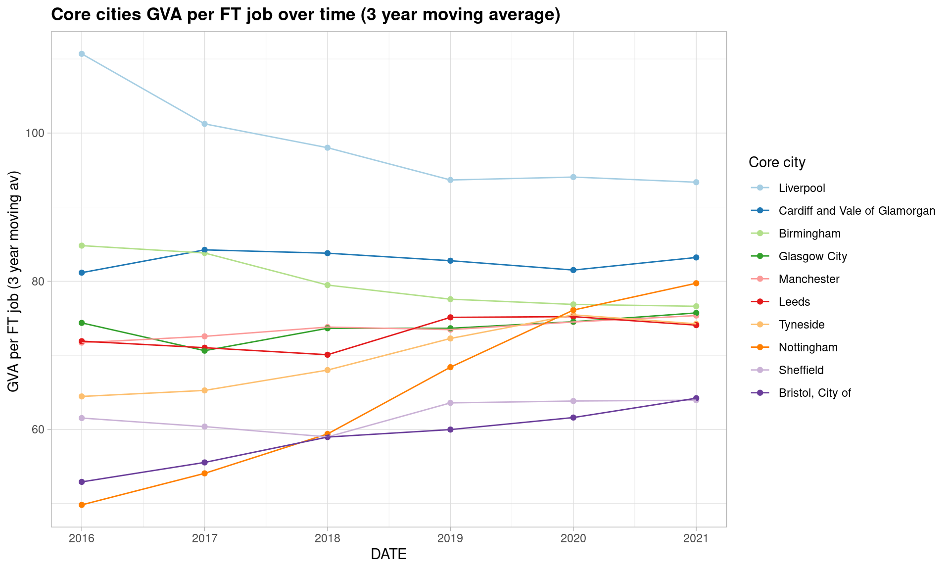
How do production vs services vary across the UK?
Next, we look at the broadest sector breakdown, and at ITL3 places, which (as above) includes most major cities and local authorities (though some are combined into one zone, like Barnsley, Doncaster & Rotherham). The data link is nabbed from the pre-baked data page.
The code will also work for ITL2 zones using this data (mayoral authorities are at this level) - just use this CSV in place of ITL3 below.
We use current prices data - GVA values as they were when the data was collected, not adjusted for inflation. This is useful because (unlike inflation adjusted chained volume data), these can be legitimately summed in any way like - add up sectors, places etc. This means any change over time for current prices is only ever relative. (Examples below will illustrate this.)
Also, sum the two ‘production’ and ‘construction’ sectors to give us just two ‘goods v services’ categories.
#Load 3 broad sector data for ITL2 and current prices
itl3.ps <- read_csv('https://raw.githubusercontent.com/DanOlner/RegionalEconomicTools/refs/heads/gh-pages/data/regionalGVA/regionalGVA_currentprices_ITL3_SIC_3GROUPS_LONG_2022.csv')

#sum production and construction
itl3.ps <- itl3.ps %>%
  mutate(SIC07_description = fct_collapse(SIC07_description, `Goods sector` = c("Production sector","Construction"))) %>%
  group_by(Region_name, year, SIC07_description) %>%
  summarise(
    value = sum(value),
    ITL_code = max(ITL_code)#This just keeps a single ITL code, they're all the same in this group. We need it to match on later as names don't perfectly match
  ) %>%
  ungroup()
Looking at location quotients
Now let’s use location quotients (LQs) to see where goods and services are most concentrated across the UK.
This post goes into much more depth with LQs, looking at ways to compare places and break them down into 2D proportion plots. It has a full explanation of LQs - but briefly:
- If the LQ > 1, that sector is relatively more concentrated in the region, compared to the UK
- If the LQ < 1, it’s relatively less concentrated in the region, compared to the UK
- … and the value says by how much e.g. an LQ of 2 would mean it’s twice as concentrated.
LQs also have a handy feature:
- As the ONS Excel sheet on LQs make really clear, because (A/B)/(C/D) is equivalent to (A/C)/(B/D), the LQ actually captures two related ways of seeing the same thing: how relatively concentrated sectors are across a whole geography like the UK, and how concentrated within a subgeography like South Yorkshire they are. (See the table in the ONS document - numbers which can be read either across geographies or across sectors.)
(Note also: LQs only make sense for current prices data. Chained volume data can’t be summed, as each row is inflation-adjusted invididually and e.g. ITL3 zones or sectors don’t sum to larger geographies or SIC groupings because of that. LQs need to sum sectors and places to correctly work out proportions.)
First, using a function loaded above, this adds LQ details to the loaded CSV:
lq.latestyear <- add_location_quotient_and_proportions(
  itl3.ps %>% filter(year == max(year)),#use the latest year in the data
  regionvar = Region_name,
  lq_var = SIC07_description,
  valuevar = value
)
Then - ordering ITL3 zones by which has the highest goods-sector concentrations, comparing different places. Here, just outputting the ordered data and picking the top 15.
lq.latestyear %>% filter(
  SIC07_description == 'Goods sector'
  ) %>%
  mutate(regional_percent = sector_regional_proportion *100) %>%
  select(Region_name,regional_percent, LQ) %>%
  arrange(-LQ) %>%
  slice(1:15)
# A tibble: 15 × 3
Region_name regional_percent LQ
<chr> <dbl> <dbl>
1 North and North East Lincolnshire 53.7 2.83
2 Mid Ulster 50.5 2.66
3 Flintshire and Wrexham 48.7 2.57
4 West Cumbria 44.0 2.32
5 South and West Derbyshire 40.7 2.15
6 Durham CC 39.2 2.07
7 Derby 37.1 1.95
8 Mid and East Antrim 35.9 1.89
9 Northumberland 35.3 1.86
10 Fermanagh and Omagh 35.2 1.85
11 Central Valleys 35.0 1.84
12 Mid Lancashire 34.9 1.84
13 Gwent Valleys 34.3 1.81
14 Armagh City, Banbridge and Craigavon 33.9 1.79
15 Kingston upon Hull, City of 33.8 1.78Services is of course the mirror image of this, and we could list them - but taking a look at a map of goods sector LQ is also a good way of seeing what’s going on. A couple of notes:
- Log LQ is used as this keeps it symmetrical each side of zero, which makes the map a lot more legible (with the downside that log values aren’t as interpretable).
- Zones with LQ < 1 for goods are highlighted in thicker black lines - making clear that more service-heavy places tend to be towns and cities (and a swathe of London and the South East).
- Plotting an interactive map here so it’s easier to poke around / zoom in - change tmap_mode to ‘plot’ to just output as an image.
Making a map
#Load ITL3 map geodata
itl3.geo <- st_read('data/ITL_geographies/International_Territorial_Level_3_January_2021_UK_BUC_V3_2022_6920195468392554877', quiet = T)

#Check geo and data row matches... tick
#Names don't quite match between the two, random commas etc
# table(itl3.geo$ITL321CD %in% itl3.ps$ITL_code)

#Join map data to a subset of the GVA data
LQ_map <- itl3.geo %>%
  right_join(
    lq.latestyear %>% filter(
      SIC07_description == 'Goods sector'
      ),
    by = c('ITL321CD'='ITL_code')
  )

tmap_mode('view')#Use 'plot' to just plot an image

#Make map for interactive viewing
tm_shape(LQ_map) +
  tm_polygons('LQ_log', n = 9, id = 'Region_name', fill.scale = tm_scale(values = "RdBu")) +
tm_shape(LQ_map %>% filter(LQ < 1)) + #Highlight LQ < 1 places by overlaying thicker lines
  tm_polygons(lwd = 2, alpha = 0, border.col = 'black', , id = 'Region_name') +
  tm_layout(title = 'LQ spread of\nGoods sector\nAcross ITL3 regions', legend.outside = T)
How have the proportion of goods vs services changed over time?
What’s been happening to goods vs service sectors across the UK since this dataset’s earliest date in 1998? We can examine the linear slopes to get a rough idea of what direction trends have been going in.
First, let’s re-run the LQ function for every year in the dataset:
itl3.ps <- itl3.ps %>%
  split(.$year) %>%
  map(add_location_quotient_and_proportions,
      regionvar = Region_name,
      lq_var = SIC07_description,
      valuevar = value) %>%
  bind_rows()
Then use another function that finds OLS slopes of change over time (not great time series statistics, useful for a quick look). We use the “sector regional proportion” value that came with the LQ function (this sums to one for all sectors in a place) and log values so places with different sector scales have comparable slopes (e.g. a 4-5% increase appears the same as 40-50%):
Using linear slopes to examine biggest growers and shrinkers
#Use
#LQ_slopes %>% filter(slope==0)
#To see which didn't get slopes (all got slopes here but sometimes there'll be missing values)
LQ_slopes <- compute_slope_or_zero(
  data = itl3.ps,
  Region_name, SIC07_description,#slopes will be found within whatever grouping vars are added here
  y = log(sector_regional_proportion), x = year
  # y = LQ_log, x = year
  ) %>% left_join(
    itl3.ps %>% select(Region_name,ITL_code) %>% distinct(), by = 'Region_name'#Add ITL code back in, so we can link to geodata below
  ) %>%
  arrange(-slope) %>%
  mutate(approx_percentchange_peryear = slope * 100)
Using that, we can ask: where does it look like the proportion of services sectors has grown the most? Just sorting by slope size:
LQ_slopes %>% filter(
  SIC07_description == 'Services sector'
  ) %>%
  select(Region_name,approx_percentchange_peryear) %>%
  arrange(-approx_percentchange_peryear) %>%
  slice(1:15)
# A tibble: 15 × 2
Region_name approx_percentchange_peryear
<chr> <dbl>
1 Mid and East Antrim 2.08
2 Essex Thames Gateway 1.24
3 Sandwell 1.05
4 East Lancashire 1.02
5 Clackmannanshire and Fife 0.891
6 Wolverhampton 0.889
7 Stoke-on-Trent 0.852
8 Solihull 0.848
9 Scottish Borders 0.831
10 Darlington 0.818
11 West Lothian 0.776
12 Falkirk 0.718
13 Thurrock 0.714
14 Swindon 0.714
15 Hartlepool and Stockton-on-Tees 0.694We can make a map again, looking at what percentage change per year, on average, the slopes look like across the UK. There’s no obvious pattern to places where services have shrunk as a proportion of their economies - but as with the list above, East Antrim is an outlier. We’ll see in a second how much work “as a proportion” is doing…
(Note, not an interactive map as it appears tmap/leaflet can only display one per page at the moment - it’s changed back to ‘plot’ mode).
slopes_map <- itl3.geo %>%
  right_join(
    LQ_slopes %>% filter(
      SIC07_description == 'Services sector'
      ),
    by = c('ITL321CD'='ITL_code')
  )


tmap_mode('plot')

#Make map
tm_shape(slopes_map) +
  tm_polygons('approx_percentchange_peryear', id = 'Region_name', fill.scale = tm_scale(values = "RdBu")) +
tm_layout(title = 'Services sector approx. % GVA change per year, ITL3 regions', legend.outside = T) 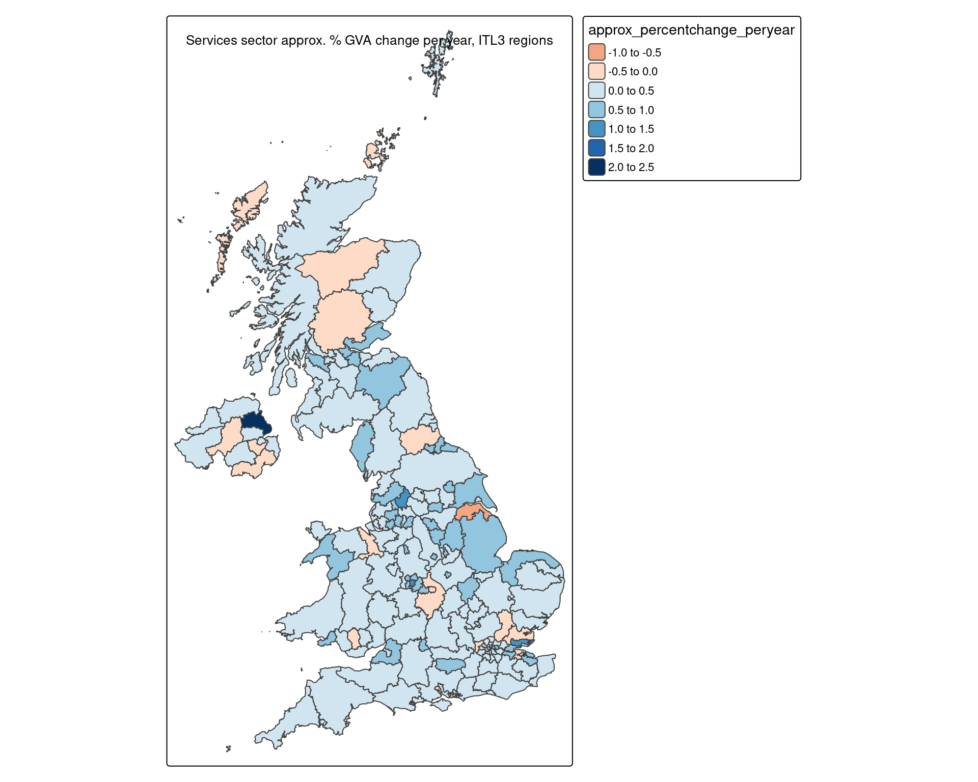
Plotting time series for places where services grew/shrunk the most
Let’s take a look at the actual datapoints for ‘percent of regional economy that’s services’, using the slopes data to extract the top (highest proportional growth) and bottom (highest prop shrinkage) slopes.
- First, get the place names for top and bottom
- Then in one ggplot for each of those, just look at the 1998 to latest datapoints
- Using the excellent patchwork library to easily combine and title these two plots.
#Has already been ordered by slope, so can just filter and pull out
#We just want the place names, to then plot their slopes
topITL3names <- LQ_slopes %>%
  filter(SIC07_description == "Services sector") %>%
  slice_head(n = 12) %>%
  select(Region_name) %>%
  pull

bottomITL3names <- LQ_slopes %>%
  filter(SIC07_description == "Services sector") %>%
  slice_tail(n = 12) %>%
  select(Region_name) %>%
  pull


top.plot <- ggplot(itl3.ps %>%
         mutate(regional_percent = sector_regional_proportion *100) %>%
         filter(
           Region_name %in% topITL3names,
           SIC07_description == "Services sector"
           ),
       aes(x = year, y = regional_percent, colour = fct_reorder(Region_name,-sector_regional_proportion) )) +
  geom_point() +
  geom_line() +
  scale_color_brewer(palette = 'Paired', direction = 1) +
  ylab('Regional GVA percent') +
  theme(plot.title = element_text(face = 'bold')) +
  labs(colour = 'ITL region')


bottom.plot <- ggplot(itl3.ps %>%
         mutate(regional_percent = sector_regional_proportion *100) %>%
         filter(
           Region_name %in% bottomITL3names,
           SIC07_description == "Services sector"
           ),
       aes(x = year, y = regional_percent, colour = fct_reorder(Region_name,-sector_regional_proportion) )) +
  geom_point() +
  geom_line() +
  scale_color_brewer(palette = 'Paired', direction = 1) +
  ylab('Regional GVA percent') +
  theme(plot.title = element_text(face = 'bold')) +
  labs(colour = 'ITL region')


top.plot / bottom.plot + plot_annotation(
  title = 'Change in proportion of service sectors, 1998-2022, top/bottom ITL3 zones'
)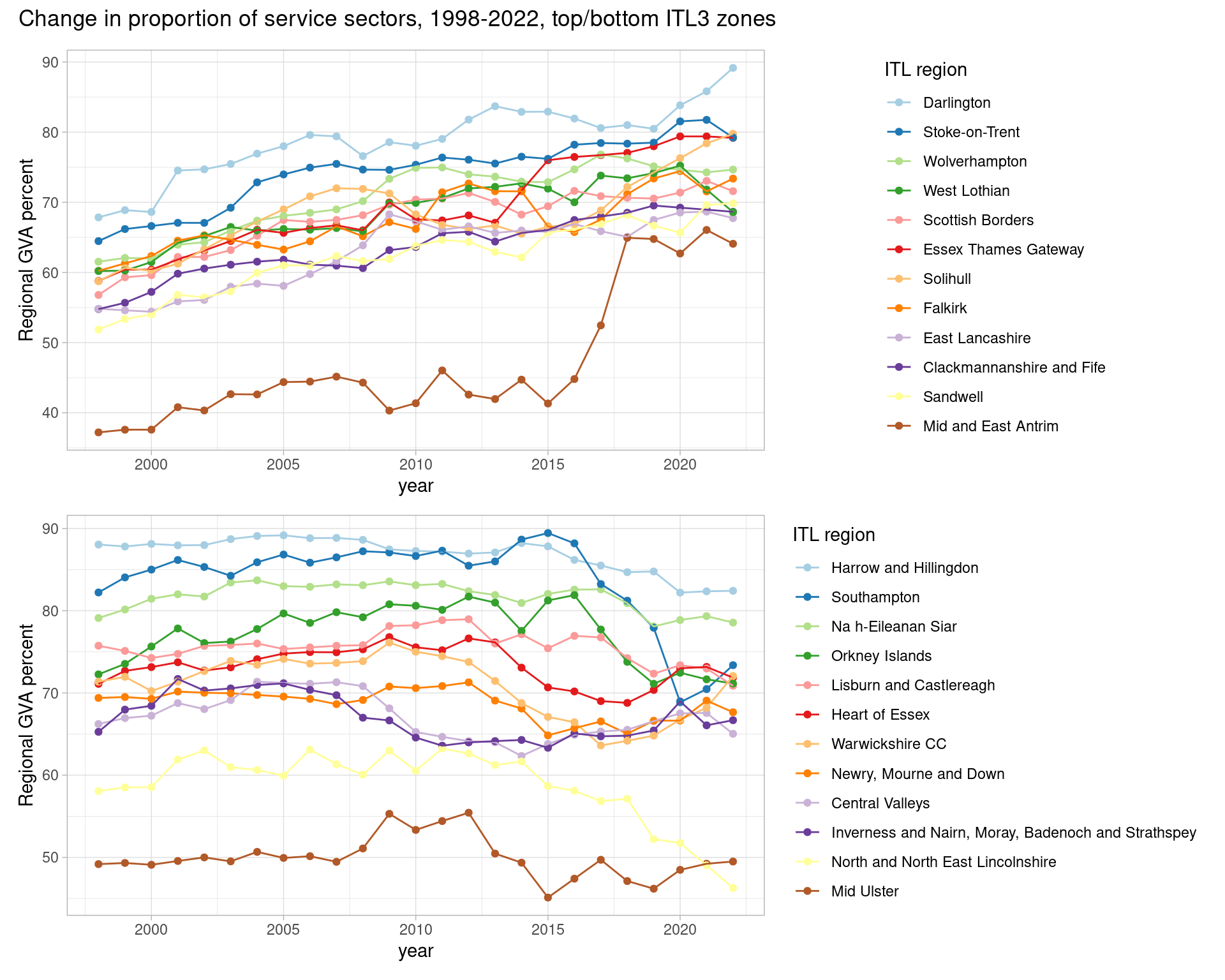
Blimey - a couple of places really jump out from each plot, both inflecting around 2016. Mid and East Antrim in the ‘top proportion growers’ jumps hugely. Southampton equally has a massive drop - never far from a mid-80% service economy, it drops to below 70% before bouncing back a little. North / northeast Lincolnshire also sees a large drop - and appeared previously at the top of the “% goods sectors” list, with nearly 3 times higher proportion than the UK as a whole.
Let’s look at a couple of these, using different approaches and datasets.
Mid and East Antrim’s change over time
Mid/East Antrim’s apparently huge services jump highlights why proportional changes need to be treated carefully. What’s happening underneath that? Did services grow - or did goods and production drop, making services a bigger percent of Mid/East Antrim’s economy?
Let’s look at the chained volume data to find out; this will let us see actual sector volume changes over time, adjusted for inflation. We’ll separate production from services.
Note: “Mid and East Antrim” has been assigned to ‘place’ - “North and North East Lincolnshire” is commented out - change if you want to use the same code to explore that (or any other place). It’s quite the opposite story to Mid/East Antrim, if this data is right.
itl3.cv <- read_csv('https://raw.githubusercontent.com/DanOlner/RegionalEconomicTools/refs/heads/gh-pages/data/regionalGVA/regionalGVA_chainedvolume_ITL3_SIC_SECTION_LONG_2022.csv')

lookup.itl3 <- read_csv('https://raw.githubusercontent.com/DanOlner/RegionalEconomicTools/refs/heads/gh-pages/data/siclookup_forregionalGVAcategories_ITL3.csv')

itl3.cv <- itl3.cv %>%
  left_join(
    lookup.itl3 %>% select(SIC07_code_sections,SIC07_code_three,SIC07_description_three) %>%
      rename(SIC07_code = SIC07_code_sections) %>% distinct(),
    by = c('SIC07_code')
  )


place = "Mid and East Antrim"
#place = "North and North East Lincolnshire"

productionplot <- ggplot(itl3.cv %>%
         filter(Region_name == place, SIC07_description_three=="Production sector"),
       aes(x = year, y = value, colour = fct_reorder(SIC07_description,-value) )) +
  geom_point() +
  geom_line() +
  scale_color_brewer(palette = 'Paired', direction = 1) +
  ylab('SIC section GVA (chained volume) ') +
  theme(plot.title = element_text(face = 'bold')) +
  labs(colour = 'SIC section') +
  facet_wrap(~SIC07_description_three)


servicesplot <- ggplot(itl3.cv %>%
         filter(
           Region_name == place,
           SIC07_description_three=="Services sector",
           !qg('households|other service', SIC07_description)
           ),
       aes(x = year, y = value, colour = fct_reorder(SIC07_description,-value) )) +
  geom_point() +
  geom_line() +
  scale_color_brewer(palette = 'Paired', direction = 1) +
  ylab('SIC section GVA (chained volume) ') +
  theme(plot.title = element_text(face = 'bold')) +
  labs(colour = 'SIC section') +
  facet_wrap(~SIC07_description_three)

#Patchwork them together
productionplot / servicesplot + plot_annotation(
  title = paste0('Production vs services GVA (chained volume) in ', place)
)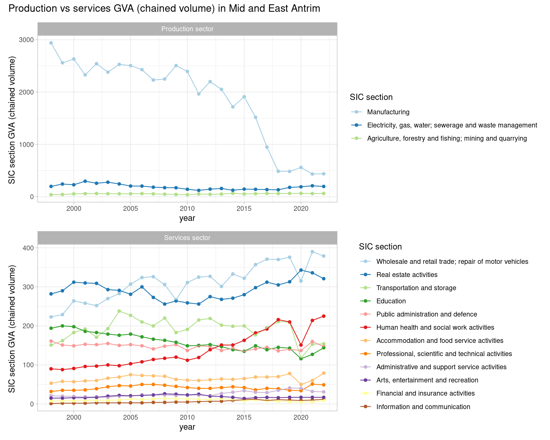
So - while some service sectors have grown, it’s very clearly that huge drop in manufacturing that accounts for the relative percent growth in services. Manufacturing was by a very long way the broad sector with the highest output, but - if this data is right - it’s dropped off a cliff.
We can dig further by loading and looking at Mid/East Antrim’s 2 digit SIC codes for manufacturing, showing that the drop has mostly happened within a single 2 digit manufacturing category. And the drop appears to have been happening more or less every year of the data.
(Uncomment the log10 line to see another point: other much-smaller-GVA manufacturing SIC groupings have been affected in a similar way, with a post-2016 drop off.)
#Load
itl3.cv <- read_csv('https://raw.githubusercontent.com/DanOlner/RegionalEconomicTools/refs/heads/gh-pages/data/regionalGVA/regionalGVA_chainedvolume_ITL3_SIC_2DIGIT_LONG_2022.csv')

itl3.cv  <- itl3.cv %>%
  left_join(
    lookup.itl3 %>% select(SIC07_code,SIC07_code_sections,SIC07_description_sections) %>% distinct(),
    by = c('SIC07_code')
  )


ggplot(itl3.cv %>%
         filter(Region_name == place, SIC07_description_sections=="Manufacturing"),
       aes(x = year, y = value, colour = fct_reorder(SIC07_description,-value) )) +
  geom_point() +
  geom_line() +
  scale_color_brewer(palette = 'Paired', direction = 1) +
  ylab('SIC GVA (chained volume) ') +
  theme(plot.title = element_text(face = 'bold')) +
  # scale_y_log10() +
labs(colour = 'SIC 2 digit') 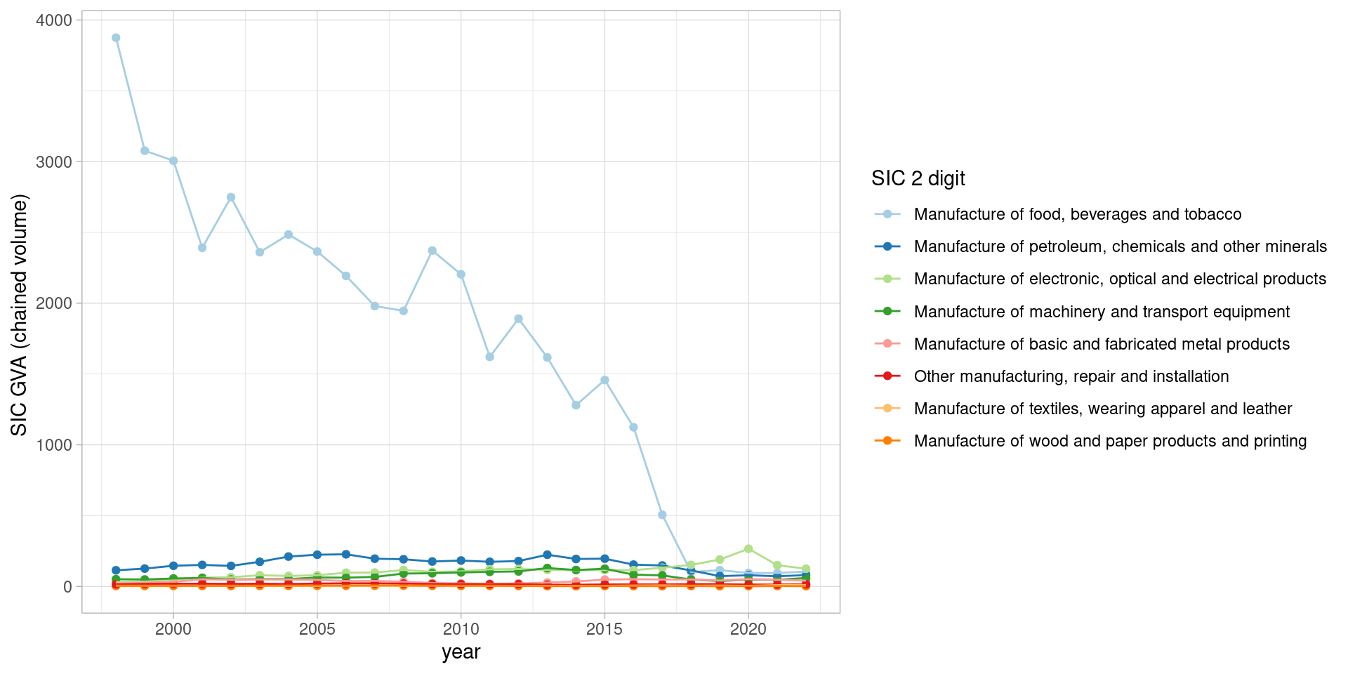
Southampton’s GVA versus job change over time: wigglyplot
Mid and East Antrim doesn’t have BRES jobs data - BRES doesn’t cover Northern Ireland. For ITL3 zones in Great Britain, though, we can use the joined GVA and BRES job data to see how each moved together.
BRES data begins in 2015, so the joined data loses the GVA data’s deeper history going back to 1998.
The following plot does this for Southampton’s SIC sections - directly plotting both chained volume GVA and full time job counts as they changed from 1998.
The first thing we do after loading the chained volume data: use the zoo library to make a moving average over time to more easily see the trends. (Note: in the function for the plot, the non-smoothed values are commented out if you want to see how messy that makes the plot!)
Doing this for 2015 to 2022 gives six smoothed datapoints.
gva.jobs.ITL3 <- read_csv('https://raw.githubusercontent.com/DanOlner/RegionalEconomicTools/refs/heads/gh-pages/data/regionalGVA_plus_BRESjobcounts/regionalGVA_plus_BRESjobcounts_chainedvolume_ITL3_SIC_SECTION_MINUSimputedrent_2022.csv')

#Make a 3 year moving average
smoothband = 3

#Find GVA per FT job and add moving avs
gva.jobs.ITL3 <- gva.jobs.ITL3 %>%
  mutate(gvaperjob = gva/JOBCOUNT_FULLTIME) %>%
  # mutate(gvaperjobFT = gva/JOBCOUNT_ALLINEMPLOYMENT) %>%
group_by(GEOGRAPHY_NAME,SIC07_description) %>%
  mutate(
  jobcount_movingav = rollapply(JOBCOUNT_FULLTIME,smoothband,mean,align='center',fill=NA),
  # jobcount_movingav = rollapply(JOBCOUNT_ALLINEMPLOYMENT,smoothband,mean,align='center',fill=NA),
  gva_movingav = rollapply(gva,smoothband,mean,align='center',fill=NA),
  `gva/job moving av` = rollapply(gvaperjob * 1000,smoothband,mean,align='center',fill=NA)
) %>%
  ungroup()
Next, this function puts that into a 2D ‘wiggle’2 plot that shows every datapoint over time (2016 and 2021 are the start and end points, as the 3 year averages cover 2015-17 and 2020-2022).
It takes a bit of staring but it’s worth it to get a single-view idea of all major regional economic movements and what they mean.
(Note the option to change over and look at other places - North East Lincolnshire is very interesting on this plot.)
p <- twod_generictimeplot_multipletimepoints(
  df = gva.jobs.ITL3 %>% filter(
    qg('southampton',GEOGRAPHY_NAME),
    !qg('agri|constr',SIC07_description),
    jobcount_movingav > 2500
    ),
  category_var = SIC07_description,
  # x_var = gva,
  # y_var = JOBCOUNT_FULLTIME,
  # label_var = gvaperjobFT,
  x_var = gva_movingav,
  y_var = jobcount_movingav,
  label_var = `gva/job moving av`,
  timevar = DATE,
  times = c(2016:2021)
)

p + theme(aspect.ratio=1) +
  # scale_x_log10() +
  # scale_y_log10() +
  xlab(paste0("GVA (",smoothband," year moving average)")) +
  ylab(paste0("Job count FT (",smoothband," year moving average)"))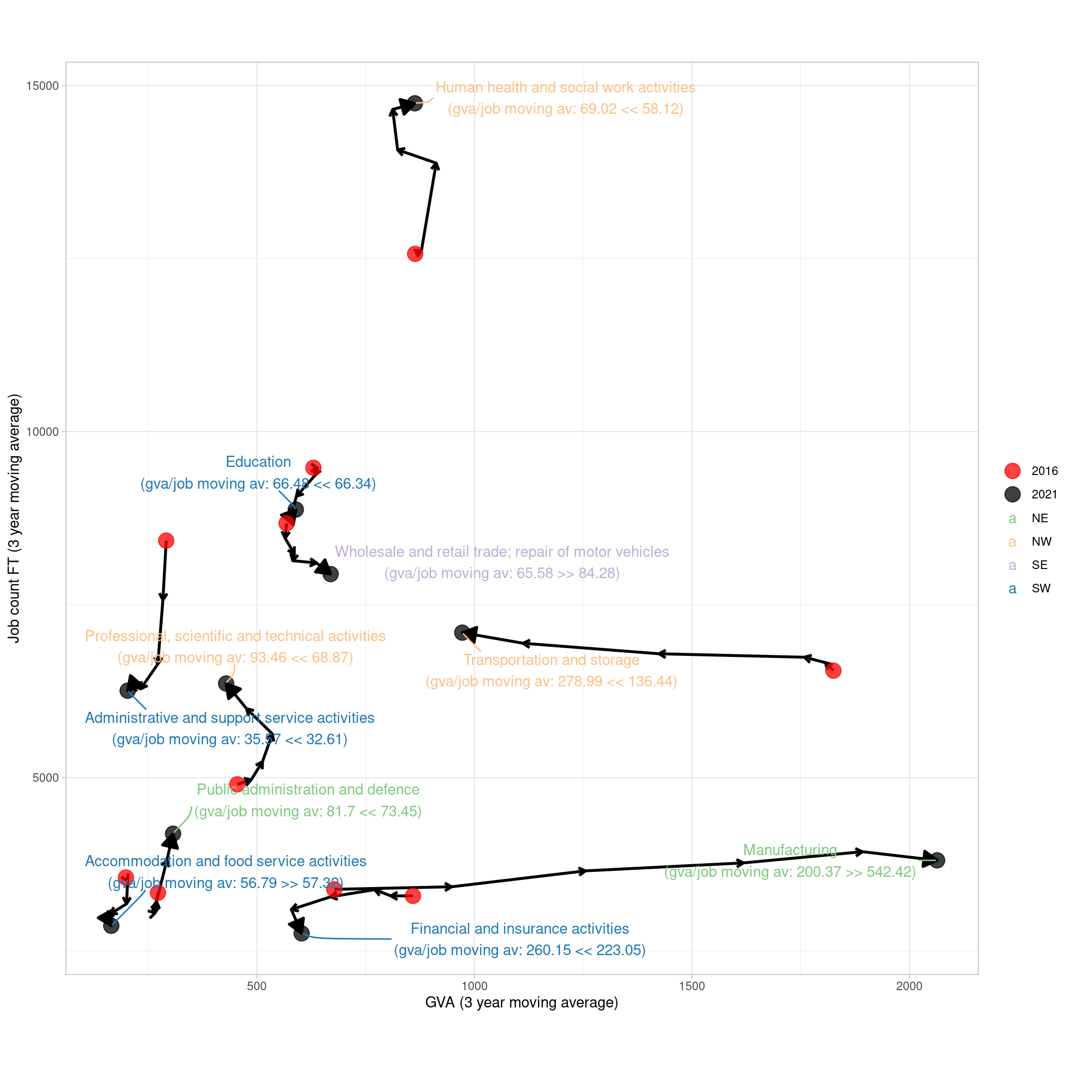
What can we see here?
- The likely explanation for Southampton’s proportional drop in service sectors: look at manufacturing (bottom of plot). It starts in 2016 (red dot, 2015-17 average) and ends in 2021 (2020-22 average, black dot), with each datapoint marked by a tiny arrow pointing along its change path.
- Manufacturing GVA has pretty much exactly tripled over the time series (remember, this is chained volume, so adjusted for inflation - this is a real tripling of value, if the data’s right).
- But jobs have increased much less (around 400 extra, starting at about 3400 in 2015-17). As a result, GVA per job has gone from 200K to 542K (see labels). Manufacturing has a much smaller job count than other SIC sections here, but it’s far ahead in GVA/job.
- Going exactly the opposite way, Transportation/storage has a good chunk more jobs but - while it’s again slightly increased those numbers - GVA has been consistently dropping.
- Compass quadrants (NE, NW etc) show which sectors had joint GVA and jobs growth (green / NE). Manufacturing is - just - in that category.
So what’s going on with those places?
It appears to be a combination of genuine economic changes and ONS method alteration after publication of the Blue Book 2022. Southampton Data Observatory say:
“The ONS identified a change in the UK National Accounts that resulted in a long-term revision to the manufacturing of food, beverages and tobacco industry. This change happened to be concentrated in the Southampton area.”
GVA for overseas operations of firms based in Southampton previously hadn’t been included; now it is (see also here for Blue Book 2023).
While these changes don’t cause huge national shifts in GVA (although some) the regional impact varies - hence what we see in Southampton and Mid/East Antrim.
The ONS explain another key source of change here - a move towards using direct VAT data in addition to survey data, which has in some cases quite radically altered measured output:
“These upward revisions to manufacturing are driven by the incorporation of Value Added Tax (VAT) data for Quarter 3 2022 and updated data in other quarters. This is the case in particular in the manufacture of computer, electronic and optical products and manufacture of food products, beverages and tobacco.”
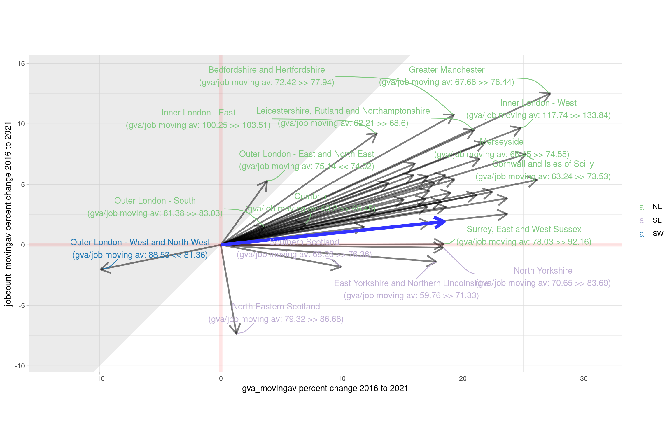
Percent change in services for all ITL2 zones
The next plot takes advantage of having both GVA and jobs data to see how the proportion of service sectors has changed, along with jobs, percent-wise. This is mostly the same data as the previous plot, with some changes:
- Percent change, all places normalised to start at zero (we’d usually filter out smaller size sectors in this plot, but service sectors together are a large chunk of all local economies).
- The grey diagonal shaded area is the “productivity dropped here” region of the plot. Combined with the compass point directions, it’s thus possible to see: did a place increase productivity through GVA and job increases, or just one or the other? In North-Eastern Scotland, for example, services productivity increased, combined with ~7% job losses ins services. Outer London E/NE productivity dropped despite both GVA and jobs going up, as the GVA increased proportionally less.
gva.jobs.ITL2.3groups <- read_csv('https://raw.githubusercontent.com/DanOlner/RegionalEconomicTools/refs/heads/gh-pages/data/regionalGVA_plus_BRESjobcounts/regionalGVA_plus_BRESjobcounts_currentprices_ITL2_SIC_3GROUPS_MINUSimputedrent_2022.csv') %>%
  split(.$DATE) %>%
  map(add_location_quotient_and_proportions,
      regionvar = GEOGRAPHY_NAME,
      lq_var = SIC07_description,
      valuevar = gva) %>%
  bind_rows()


gva.jobs.ITL2.3groups <- gva.jobs.ITL2.3groups %>%
  mutate(gvaperjob = gva/JOBCOUNT_FULLTIME) %>%
group_by(GEOGRAPHY_NAME,SIC07_description) %>%
  mutate(
  jobcount_movingav = rollapply(JOBCOUNT_FULLTIME,smoothband,mean,align='center',fill=NA),
  gva_movingav = rollapply(gva,smoothband,mean,align='center',fill=NA),
  `gva/job moving av` = rollapply(gvaperjob * 1000,smoothband,mean,align='center',fill=NA)
) %>%
  ungroup()

#Add into 2D percent plot
twod_percentplot(
  df = gva.jobs.ITL2.3groups %>% filter(SIC07_description=='Services sector'),
  category_var = GEOGRAPHY_NAME,
  x_var = gva_movingav,
  y_var = jobcount_movingav,
  timevar = DATE,
  label_var = `gva/job moving av`,
  category_var_value_to_highlight = 'South Yorkshire',
  start_time = 2016,
  end_time = 2021
)
Productivity comparison over time and to other places
This last plot is another way to see how a place is changing over time relative to others in the UK. It uses chained volume data for ITL2 zones again, and picks out one place (Leicestershire, Rutland and Northamptonshire) to show how (1) SIC section GVA per full-time worker has changed over time (here, moving average again) and (2) how its productivity compares to other places (blue dots). A sub-selection of SIC sections of interest are picked out.
A few things jump out:
- ICT productivity has increased everywhere; Leicester/Rutland follows that trend
- As it does for health and social care, which has seen declining productivity by this metric in recent years (though note with more public-service sectors, ONS estimate GVA by multiplying up from the number of workers, so the numbers are a little circular if dividing by them again.)
- There’s an interactive version here where it’s possible to see that the manufacturing productivity outlier is Cheshire, for example (hover over points). ggplotly code in the comment below creates this kind of plot.
gva.jobs.ITL2.sections.cv <- read_csv('https://raw.githubusercontent.com/DanOlner/RegionalEconomicTools/refs/heads/gh-pages/data/regionalGVA_plus_BRESjobcounts/regionalGVA_plus_BRESjobcounts_chainedvolume_ITL2_SIC_SECTION_MINUSimputedrent_2022.csv') %>%
  mutate(
    gvaperjob = (gva/JOBCOUNT_FULLTIME) * 1000
  )


gva.jobs.ITL2.sections.cv <- gva.jobs.ITL2.sections.cv %>%
  mutate(gvaperjob = gva/JOBCOUNT_FULLTIME) %>%
group_by(GEOGRAPHY_NAME,SIC07_description) %>%
  mutate(
  jobcount_movingav = rollapply(JOBCOUNT_FULLTIME,smoothband,mean,align='center',fill=NA),
  gva_movingav = rollapply(gva,smoothband,mean,align='center',fill=NA),
  `gva/job moving av` = rollapply(gvaperjob * 1000,smoothband,mean,align='center',fill=NA)
) %>%
  ungroup()


gva.jobs.ITL2.sections.cv <- gva.jobs.ITL2.sections.cv %>%
  mutate(
    SIC_SECTION_REDUCED = case_when(
      # grepl('admin',SIC07_description,ignore.case = T) ~ 'Admin',
      grepl('agri',SIC07_description,ignore.case = T) ~ 'Agri',
      grepl('electr',SIC07_description,ignore.case = T) ~ 'power',
      grepl('information',SIC07_description,ignore.case = T) ~ 'ICT',
      grepl('manuf',SIC07_description,ignore.case = T) ~ 'Manuf',
      grepl('mining',SIC07_description,ignore.case = T) ~ 'Mining',
      grepl('other',SIC07_description,ignore.case = T) ~ 'other',
      grepl('scientific',SIC07_description,ignore.case = T) ~ 'Scientific',
      grepl('real estate',SIC07_description,ignore.case = T) ~ 'Real est',
      grepl('transport',SIC07_description,ignore.case = T) ~ 'Transport',
      grepl('water',SIC07_description,ignore.case = T) ~ 'Water',
      grepl('entertainment',SIC07_description,ignore.case = T) ~ 'Entertainment',
      grepl('human health',SIC07_description,ignore.case = T) ~ 'Health/soc',
      grepl('food service activities',SIC07_description,ignore.case = T) ~ 'Food/service',
      grepl('wholesale',SIC07_description,ignore.case = T) ~ 'Retail',
      .default = SIC07_description
    )
  )

#PLOT: GVA PER FT JOB FOR SIC SECTIONS OVER TIME
ggplot(
  gva.jobs.ITL2.sections.cv %>%
    filter(qg('constr|manuf|scientific|information|transport|health|food|entertainment',SIC07_description)) %>%
    mutate(
    DATE = DATE - 2000,#Make dates 2 digit, more readable on axis
    placetoshow = qg('leic',GEOGRAPHY_NAME),#get leicester ITL2
    SIC_SECTION_REDUCED = fct_reorder(SIC_SECTION_REDUCED, gvaperjob, .desc = T)
    ),
  aes(x = DATE, y = `gva/job moving av`, group = GEOGRAPHY_NAME, size = placetoshow, colour = placetoshow)) +
  coord_cartesian(xlim = c(16,21)) +
  geom_jitter(width = 0.1) +
  scale_size_manual(values = c(1,5)) +
  scale_colour_brewer(palette = 'Set1', direction = -1, name = "Sector") +
  facet_wrap(~SIC_SECTION_REDUCED, nrow = 1, labeller = labeller(groupwrap = label_wrap_gen(10))) +
  guides(colour = F, size = F) +
  xlab('year') +
  ylab('GVA per FT (3 year moving average)')
#ggplotly for interactive
#ggplotly(p, tooltip = 'GEOGRAPHY_NAME', width = 1100, height = 700)