I presented at a Sheffield University Data Stewards’ Network event, talking about the pipelines I’ve been building for ONS economic data and Companies House data (slides online here). As well as evangelising about the wonders of Quarto + R for ease-of-pipeline-making (e.g. downloading / extracting all ONS data, harmonising/combining then auto-updating webpages to serve it), I talked about how open data and tools can help support analytic capacity growth in regional/local government, helping us move a bit closer to a shared sense of ground truth.
Also presenting were the excellent folks from UoS’ Urban Flows Observatory, talking about all the fun they’ve had getting an entire citywide sensor network up and running and making that accessible through their portal.
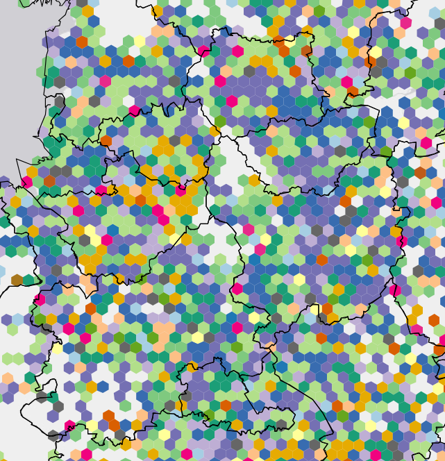
The slides have some linked interactive pages and reports - a quick list of those here:
- Great Britain interactive hexmap of Companies House data I’ve been working to make accessible as well as open (currently ‘open but opaque’). Each 5km-across-hex shows the modal sector (most common there by job count in most recent accounts) and only showing hexes with a min of 50 employees. Hover over the map for a pop up of the sector there - trying to just use the key here is tricky, far too many categories / bad map! Patterns to look out for: the manufacturing doughnut drawing a circle from Sheffield through Birmingham and Manchester; the Southern sci-tech areas, also quite heavily present in Manchester. Also note where there are not a min of 50 employees - an interesting picture of the economic landscape. This was a first test to demonstrate how rich this dataset is if one can access the whole national picture (not just whatever count limits private versions of this data impose e.g. FAME). A lot of work yet to do though…
- Higher resolution hexmap just for Yorkshire - 1km-across hex, with minimum ten employees per hex.
- South Yorkshire’s four local authorities job percent change since last accounts, compared to ‘core cities’, using the last year’s Companies House data (hover for place name).
- Companies House South Yorkshire shiny dashboard 1st draft. Click on firms for more details, view sector and change to ‘percent change from last year’.
- Quarto online report example looking at business demography in South Yorkshire (note the nice hover-for-plot feature built in, surprise to me when it compiled!)
- Intro to using linked ONS output and jobs data in R (with link to rest of pipeline)
- Early draft shiny dashboard for location quotient plots and SICSOC comparison plots (that show relative job skill levels for the chosen ITL2 zone) - see the tabs.
I also mentioned the amazing Leeds Research Collaboration Framework and Centre for Cities’ LA Evidential report.